コンポーネント一覧へ戻る
これは何か
プロフィールページの上部に置く白いセクションです。無地のカバーにアバターが重なり、名前・ハンドル・短い自己紹介、Followers 2,481・Following 312・Projects 27 の数字、Message と Follow のボタンが並びます。Follow を押すと Following に幅が変わり、フォロワー数が1つ転がって増えます。もう一度押すと戻ります。Overview・Projects・Activity のタブは下線が滑り、中身が入れ替わってカードの高さが追従します。名前・数字・タブの中身を差し替えて、コミュニティやポートフォリオ、社内名簿にそのまま置けます。
TSX の全文です。アカウントは不要です。
profile-header-section.tsx
"use client"; import * as React from "react";import { Calendar, Check, CreditCard, FileText, ImagePlus, Layers, Link, MapPin, MessageSquare, Plus, TramFront, UserPlus, type LucideIcon,} from "lucide-react";import { AnimatePresence, animate, motion, useReducedMotion } from "motion/react";import { cn } from "@/lib/utils"; export type ProfileHeaderStat = { id: string; label: string; value: number;}; export type ProfileHeaderProject = { id: string; title: string; meta: string;}; export type ProfileHeaderActivity = { id: string; text: string; time: string;}; export type ProfileHeaderTab = "overview" | "projects" | "activity"; export type ProfileHeaderLabels = { follow?: string; following?: string; /** Shown in place of `following` while that button is hovered. */ unfollow?: string; message?: string; overview?: string; projects?: string; activity?: string; about?: string;}; export type ProfileHeaderSectionProps = Omit< React.ComponentPropsWithoutRef<"div">, "onDrag" | "onDragStart" | "onDragEnd" | "onAnimationStart"> & { name?: string; handle?: string; bio?: string; /** Longer text in the Overview tab. */ about?: string; location?: string; website?: string; joined?: string; /** Optional cover image. A flat muted fill shows when unset. */ coverSrc?: string; /** Optional avatar image. Initials show when unset. */ avatarSrc?: string; /** The stat with id "followers" follows the Follow button. */ stats?: readonly ProfileHeaderStat[]; projects?: readonly ProfileHeaderProject[]; activity?: readonly ProfileHeaderActivity[]; following?: boolean; defaultFollowing?: boolean; onFollowingChange?: (following: boolean) => void; onMessage?: () => void; tab?: ProfileHeaderTab; defaultTab?: ProfileHeaderTab; onTabChange?: (tab: ProfileHeaderTab) => void; labels?: ProfileHeaderLabels;}; const EASE = "cubic-bezier(0.22, 1, 0.36, 1)";const EASE_CURVE = [0.22, 1, 0.36, 1] as const;const FOCUS = "outline-none focus-visible:outline-none focus-visible:ring-2 focus-visible:ring-zinc-900/35 focus-visible:ring-offset-2"; const CSS = `@keyframes profile-header-section-in-up { from { opacity: 0; transform: translateY(100%); } to { opacity: 1; transform: none; } }@keyframes profile-header-section-in-down { from { opacity: 0; transform: translateY(-100%); } to { opacity: 1; transform: none; } }@keyframes profile-header-section-out-up { from { opacity: 1; transform: none; } to { opacity: 0; transform: translateY(-100%); } }@keyframes profile-header-section-out-down { from { opacity: 1; transform: none; } to { opacity: 0; transform: translateY(100%); } }.profile-header-section-in-up { animation: profile-header-section-in-up 200ms ${EASE} both; }.profile-header-section-in-down { animation: profile-header-section-in-down 200ms ${EASE} both; }.profile-header-section-out-up { animation: profile-header-section-out-up 200ms ${EASE} both; }.profile-header-section-out-down { animation: profile-header-section-out-down 200ms ${EASE} both; }@media (prefers-reduced-motion: reduce) { .profile-header-section-in-up, .profile-header-section-in-down { animation: none; } .profile-header-section-out-up, .profile-header-section-out-down { animation: none; opacity: 0; }}`; const DEFAULT_STATS: readonly ProfileHeaderStat[] = [ { id: "followers", label: "Followers", value: 2481 }, { id: "following", label: "Following", value: 312 }, { id: "projects", label: "Projects", value: 27 },]; const DEFAULT_PROJECTS: readonly ProfileHeaderProject[] = [ { id: "pr1", title: "Harbor checkout", meta: "Case study · 2026" }, { id: "pr2", title: "Lumen design system", meta: "Open source · 2025" }, { id: "pr3", title: "Kite Transit app", meta: "Mobile · 2025" },]; const DEFAULT_ACTIVITY: readonly ProfileHeaderActivity[] = [ { id: "a1", text: "Published “Designing calm settings pages”", time: "2d" }, { id: "a2", text: "Added 4 screens to Harbor checkout", time: "5d" }, { id: "a3", text: "Started following Mina Okada", time: "1w" },]; const DEFAULT_LABELS: Required<ProfileHeaderLabels> = { follow: "Follow", following: "Following", unfollow: "Unfollow", message: "Message", overview: "Overview", projects: "Projects", activity: "Activity", about: "About",}; const TABS: readonly ProfileHeaderTab[] = ["overview", "projects", "activity"];const PROJECT_ICONS: readonly LucideIcon[] = [CreditCard, Layers, TramFront]; function initials(name: string) { return name .split(/\s+/) .slice(0, 2) .map((part) => part.charAt(0).toUpperCase()) .join("");} const LABEL_SLIDE = { duration: 0.15, ease: EASE_CURVE }; /** Lucide check, drawn with pathLength so the stroke can start empty. */function DrawnCheck({ reduced }: { reduced: boolean }) { const ref = React.useRef<SVGSVGElement>(null); React.useLayoutEffect(() => { const path = ref.current?.querySelector("path"); if (!path || reduced) return; const controls = animate(path, { pathLength: [0, 1] }, { duration: 0.2, delay: 0.04, ease: "easeOut" }); return () => controls.stop(); }, [reduced]); return <Check ref={ref} aria-hidden className="size-3.5" />;} function activityIcon(text: string): LucideIcon { const value = text.toLowerCase(); if (value.includes("follow")) return UserPlus; if (value.includes("added")) return ImagePlus; return FileText;} /** The whole figure slides out and the new one slides in, up when it grows. */function RollNumber({ value }: { value: number }) { const [pair, setPair] = React.useState({ prev: value, current: value }); if (pair.current !== value) setPair({ prev: pair.current, current: value }); const changed = pair.prev !== pair.current; const dir = pair.current < pair.prev ? "down" : "up"; const format = (n: number) => n.toLocaleString("en-US"); return ( <span className="relative inline-grid overflow-hidden tabular-nums"> {changed ? ( <span key={`out-${pair.prev}-${pair.current}`} aria-hidden className={cn("absolute inset-0", `profile-header-section-out-${dir}`)} > {format(pair.prev)} </span> ) : null} <span key={pair.current} className={changed ? `profile-header-section-in-${dir}` : undefined}> {format(pair.current)} </span> </span> );} export const ProfileHeaderSection = React.forwardRef<HTMLDivElement, ProfileHeaderSectionProps>( ( { name = "Ren Takeda", handle = "@rentakeda", bio = "Product designer at Northwind Studio. Quiet interfaces, careful motion.", about = "I design settings, billing, and onboarding flows for small teams. Before Northwind I spent four years on transit apps, which is where the love of clear timetables comes from.", location = "Kyoto, Japan", website = "rentakeda.design", joined = "Joined March 2021", coverSrc, avatarSrc, stats = DEFAULT_STATS, projects = DEFAULT_PROJECTS, activity = DEFAULT_ACTIVITY, following, defaultFollowing = false, onFollowingChange, onMessage, tab, defaultTab = "overview", onTabChange, labels, className, ...props }, ref, ) => { const text = { ...DEFAULT_LABELS, ...labels }; const reduced = useReducedMotion() === true; const uid = React.useId(); const [ownFollowing, setOwnFollowing] = React.useState(defaultFollowing); const isFollowing = following ?? ownFollowing; const [hoveringFollow, setHoveringFollow] = React.useState(false); const [liveLabel, setLiveLabel] = React.useState(""); const followRef = React.useRef<HTMLButtonElement>(null); const followWidth = React.useRef<number | null>(null); const followScale = React.useRef<{ stop: () => void } | null>(null); const [ownTab, setOwnTab] = React.useState<ProfileHeaderTab>(defaultTab); const active = tab ?? ownTab; const tabButtons = React.useRef<Partial<Record<ProfileHeaderTab, HTMLButtonElement | null>>>({}); const fade = reduced ? { duration: 0 } : { duration: 0.15, ease: EASE_CURVE }; const layoutTransition = reduced ? { duration: 0 } : { layout: { duration: 0.15, ease: EASE_CURVE } }; React.useLayoutEffect(() => { const el = followRef.current; if (!el) return; const next = el.offsetWidth; const prev = followWidth.current; followWidth.current = next; if (prev == null || prev === next || reduced) return; // Layout projection holds its scale until the exiting label unmounts, so the width flip runs here. el.style.transformOrigin = "right center"; followScale.current?.stop(); followScale.current = animate(el, { scaleX: [prev / next, 1] }, { duration: 0.15, ease: [0.22, 1, 0.36, 1] }); }, [isFollowing, reduced, text.follow, text.following, text.unfollow]); React.useEffect(() => { if (!isFollowing) return; const id = window.setTimeout(() => { if (followRef.current?.matches(":hover")) setHoveringFollow(true); }, reduced ? 0 : 220); return () => window.clearTimeout(id); }, [isFollowing, reduced]); const toggleFollow = () => { const next = !isFollowing; if (following === undefined) setOwnFollowing(next); if (!next) setHoveringFollow(false); setLiveLabel(next ? text.following : text.follow); onFollowingChange?.(next); }; const selectTab = (next: ProfileHeaderTab, focus = false) => { if (tab === undefined) setOwnTab(next); onTabChange?.(next); if (focus) tabButtons.current[next]?.focus(); }; const onTabKeyDown = (event: React.KeyboardEvent) => { const index = TABS.indexOf(active); let next: number | null = null; if (event.key === "ArrowRight") next = (index + 1) % TABS.length; if (event.key === "ArrowLeft") next = (index - 1 + TABS.length) % TABS.length; if (event.key === "Home") next = 0; if (event.key === "End") next = TABS.length - 1; if (next === null) return; event.preventDefault(); selectTab(TABS[next] ?? "overview", true); }; const tabLabel: Record<ProfileHeaderTab, string> = { overview: text.overview, projects: text.projects, activity: text.activity, }; const renderPanel = (which: ProfileHeaderTab) => { if (which === "projects") { return ( <ul className="m-0 grid list-none grid-cols-3 gap-3 p-0"> {projects.map((project, index) => { const Icon = PROJECT_ICONS[index % PROJECT_ICONS.length] ?? CreditCard; return ( <li key={project.id} className="overflow-hidden rounded-[10px] border border-zinc-200 bg-white transition-transform duration-150 ease-out hover:-translate-y-0.5 motion-reduce:transition-none motion-reduce:hover:translate-y-0" > <div aria-hidden className="grid aspect-[4/3] place-items-center bg-zinc-100 text-zinc-400"> <Icon className="size-5" /> </div> <div className="p-2.5"> <p className="m-0 truncate text-[13px] font-medium text-zinc-900">{project.title}</p> <p className="m-0 truncate text-[12px] text-zinc-500">{project.meta}</p> </div> </li> ); })} </ul> ); } if (which === "activity") { return ( <ul className="m-0 list-none p-0"> {activity.map((entry) => { const Icon = activityIcon(entry.text); return ( <li key={entry.id} className="flex h-10 items-center gap-2"> <Icon aria-hidden className="size-3.5 shrink-0 text-zinc-400" /> <span className="min-w-0 flex-1 truncate text-[13px] text-zinc-800">{entry.text}</span> <span className="shrink-0 text-[12px] text-zinc-400 tabular-nums">{entry.time}</span> </li> ); })} </ul> ); } return ( <div> <p className="m-0 max-w-[520px] text-[14px] leading-[1.6] text-zinc-700">{about}</p> <ul className="m-0 mt-4 flex list-none flex-wrap gap-x-4 gap-y-2 p-0 text-[13px] text-zinc-500"> {location ? ( <li className="inline-flex items-center gap-1.5"> <MapPin aria-hidden className="size-3.5 text-zinc-400" /> {location} </li> ) : null} {website ? ( <li className="inline-flex items-center gap-1.5"> <Link aria-hidden className="size-3.5 text-zinc-400" /> {website} </li> ) : null} {joined ? ( <li className="inline-flex items-center gap-1.5"> <Calendar aria-hidden className="size-3.5 text-zinc-400" /> {joined} </li> ) : null} </ul> </div> ); }; return ( <motion.div ref={ref} layout={reduced ? false : true} transition={layoutTransition} data-tsuna-id="profile-header-section" data-following={isFollowing ? "" : undefined} className={cn( "w-[640px] max-w-full overflow-clip rounded-2xl border border-zinc-200 bg-white text-zinc-900", "shadow-[0_18px_40px_-18px_rgba(15,23,42,0.28),0_4px_12px_-8px_rgba(15,23,42,0.14)]", className, )} {...props} > <style>{CSS}</style> <div aria-hidden className="h-24 rounded-t-2xl bg-zinc-100 bg-cover bg-center" style={coverSrc ? { backgroundImage: `url(${JSON.stringify(coverSrc)})` } : undefined} /> <div className="px-6"> <div className="flex items-end justify-between gap-3"> <span role="img" aria-label={name} className="-mt-9 grid size-[72px] shrink-0 place-items-center rounded-full bg-zinc-200 bg-cover bg-center text-[18px] font-semibold text-zinc-950 ring-[3px] ring-white" style={avatarSrc ? { backgroundImage: `url(${JSON.stringify(avatarSrc)})` } : undefined} > {avatarSrc ? null : initials(name)} </span> <div className="flex items-center gap-2"> <button type="button" onClick={onMessage} className={cn( "inline-flex h-8 cursor-pointer items-center gap-1.5 rounded-lg border border-zinc-200 bg-white px-3 text-[13px] font-medium whitespace-nowrap text-zinc-900", "transition-colors duration-150 hover:bg-zinc-50 motion-reduce:transition-none", FOCUS, )} > <MessageSquare aria-hidden className="size-3.5 text-zinc-500" /> {text.message} </button> <span className="sr-only" aria-live="polite"> {liveLabel} </span> <motion.button ref={followRef} type="button" aria-pressed={isFollowing} onClick={toggleFollow} onMouseEnter={() => { if (isFollowing) setHoveringFollow(true); }} onMouseLeave={() => setHoveringFollow(false)} onPointerDown={(event) => { if (event.pointerType !== "mouse" && event.pointerType !== "touch") return; event.currentTarget.dataset.pointer = ""; }} onBlur={(event) => { delete event.currentTarget.dataset.pointer; }} onKeyDown={(event) => { delete event.currentTarget.dataset.pointer; }} whileTap={ reduced ? undefined : { scale: 0.96, transition: { type: "spring", stiffness: 500, damping: 30 } } } className={cn( "inline-flex h-8 origin-right cursor-pointer items-center gap-1.5 rounded-lg border px-3 text-[13px] font-medium whitespace-nowrap", "outline-none transition-[background-color,border-color,color] duration-150 ease-out motion-reduce:transition-none", "focus:outline-none focus-visible:ring-2 focus-visible:ring-zinc-900/35 focus-visible:ring-offset-2", "data-[pointer]:focus-visible:ring-0 data-[pointer]:focus-visible:ring-offset-0", isFollowing ? "border-zinc-200 bg-white text-zinc-900 hover:bg-zinc-50" : "border-zinc-950 bg-zinc-950 text-white hover:border-zinc-800 hover:bg-zinc-800", )} > <span className="relative grid size-3.5 shrink-0 grid-cols-1 grid-rows-1 place-items-center"> <AnimatePresence initial={false}> {isFollowing ? ( <motion.span key="check" className="col-start-1 row-start-1 grid" initial={reduced ? false : { opacity: 0 }} animate={{ opacity: 1 }} exit={{ opacity: 0 }} transition={{ duration: reduced ? 0 : 0.15 }} > <DrawnCheck reduced={reduced} /> </motion.span> ) : ( <motion.span key="plus" className="col-start-1 row-start-1 grid" initial={reduced ? false : { opacity: 0, rotate: -90 }} animate={{ opacity: 1, rotate: 0 }} exit={reduced ? { opacity: 0 } : { opacity: 0, rotate: 90 }} transition={{ duration: reduced ? 0 : 0.15, ease: EASE_CURVE }} > <Plus aria-hidden className="size-3.5" /> </motion.span> )} </AnimatePresence> </span> <span className="relative grid"> <span aria-hidden className="invisible col-start-1 row-start-1 whitespace-nowrap"> {isFollowing ? (hoveringFollow ? text.unfollow : text.following) : text.follow} </span> {isFollowing ? ( <> <span aria-hidden className="invisible col-start-1 row-start-1 whitespace-nowrap"> {text.following} </span> <span aria-hidden className="invisible col-start-1 row-start-1 whitespace-nowrap"> {text.unfollow} </span> </> ) : null} <span className="absolute inset-0 overflow-hidden"> <AnimatePresence mode="popLayout" initial={false}> <motion.span key={isFollowing ? "following" : "follow"} className="absolute inset-x-0 top-0 whitespace-nowrap" initial={reduced ? false : { opacity: 0, y: 6 }} animate={{ opacity: 1, y: 0 }} exit={reduced ? { opacity: 0 } : { opacity: 0, y: -6 }} transition={reduced ? { duration: 0 } : LABEL_SLIDE} > {isFollowing ? ( <span className="grid"> <AnimatePresence initial={false}> <motion.span key={hoveringFollow ? "unfollow" : "following"} className="col-start-1 row-start-1" initial={reduced ? false : { opacity: 0 }} animate={{ opacity: 1 }} exit={{ opacity: 0 }} transition={{ duration: reduced ? 0 : 0.12 }} > {hoveringFollow ? text.unfollow : text.following} </motion.span> </AnimatePresence> </span> ) : ( text.follow )} </motion.span> </AnimatePresence> </span> </span> </motion.button> </div> </div> <h2 className="m-0 mt-3 text-[18px] font-semibold tracking-[-0.01em] text-zinc-950">{name}</h2> <p className="m-0 mt-1 text-[13px] text-zinc-500">{handle}</p> <p className="m-0 mt-2 max-w-[440px] text-[14px] leading-[1.5] text-zinc-900">{bio}</p> <dl className="m-0 mt-3 flex flex-wrap items-center gap-2"> {stats.map((stat, index) => ( <React.Fragment key={stat.id}> {index > 0 ? <span aria-hidden className="size-[3px] shrink-0 rounded-full bg-zinc-300" /> : null} <div className="flex items-baseline gap-1 whitespace-nowrap text-[13px]"> <dd className="m-0 font-medium text-zinc-950"> <RollNumber value={stat.value + (stat.id === "followers" && isFollowing ? 1 : 0)} /> </dd> <dt className="font-normal text-zinc-500">{stat.label}</dt> </div> </React.Fragment> ))} </dl> </div> <div className="mt-4"> <div role="tablist" aria-label={name} onKeyDown={onTabKeyDown} className="flex h-10 gap-5 px-6" > {TABS.map((key) => { const selected = key === active; return ( <button key={key} ref={(node) => { tabButtons.current[key] = node; }} type="button" role="tab" id={`${uid}-tab-${key}`} aria-selected={selected} aria-controls={`${uid}-panel`} tabIndex={selected ? 0 : -1} onClick={() => selectTab(key)} className={cn( "relative h-10 cursor-pointer border-0 bg-transparent px-0 text-[13px] font-medium shadow-none", "transition-colors duration-150 motion-reduce:transition-none", selected ? "text-zinc-950" : "text-zinc-500 hover:text-zinc-800", FOCUS, )} > {tabLabel[key]} {selected ? ( <motion.span layoutId={`${uid}-underline`} aria-hidden className="absolute inset-x-0 -bottom-px z-10 h-0.5 bg-zinc-950" transition={reduced ? { duration: 0 } : { type: "spring", stiffness: 520, damping: 42 }} /> ) : null} </button> ); })} </div> <div aria-hidden className="h-px bg-zinc-200" /> </div> <div role="tabpanel" id={`${uid}-panel`} aria-labelledby={`${uid}-tab-${active}`} className="px-6 pt-4 pb-6"> <AnimatePresence mode="popLayout" initial={false}> <motion.div key={active} initial={reduced ? false : { opacity: 0, y: 4 }} animate={{ opacity: 1, y: 0 }} exit={reduced ? { opacity: 0 } : { opacity: 0, y: 4 }} transition={fade} > {renderPanel(active)} </motion.div> </AnimatePresence> </div> </motion.div> ); },); ProfileHeaderSection.displayName = "ProfileHeaderSection";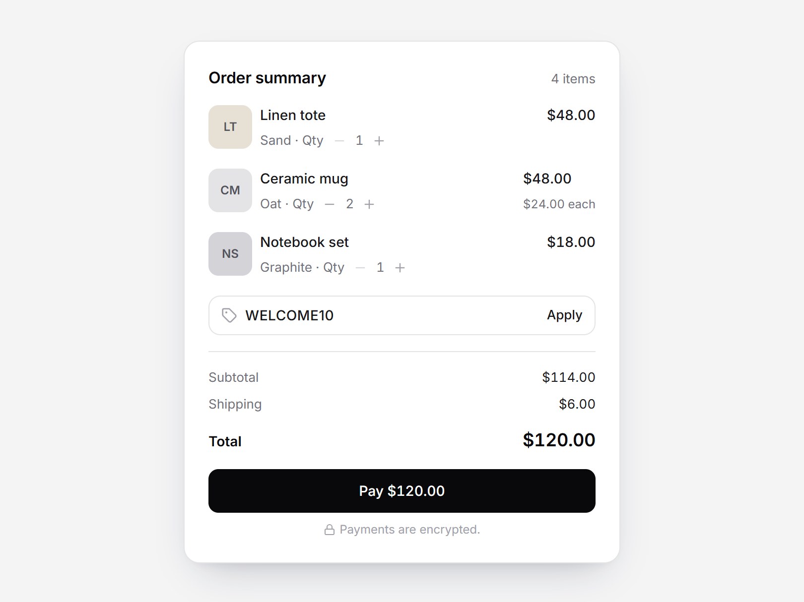
コンポーネント
プロフィールヘッダーセクション
プロフィールページの上部に置く白いセクションです。無地のカバーにアバターが重なり、名前・ハンドル・短い自己紹介、Followers 2,481・Following 312・Projects 27 の数字、Message と Follow のボタンが並びます。Follow を押すと Following に幅が変わり、フォロワー数が1つ転がって増えます。もう一度押すと戻ります。Overview・Projects・Activity のタブは下線が滑り、中身が入れ替わってカードの高さが追従します。名前・数字・タブの中身を差し替えて、コミュニティやポートフォリオ、社内名簿にそのまま置けます。
Verified Technical Spec
- アニメーション
- Framer Motion
- Reduced motion
- 確認済み
- キーボードフォーカス
- 確認済み
- 対応環境
- Tailwind CSS v3.4 + v4 · React 19 / Next.js 15 App Router + Vite / Remix 対応
含まれるもの
- ソースを Cursor / Claude に渡してエージェントに組み込める
- React · TypeScript · Tailwind CSS · Motion · Lucide の完成 UI
依存パッケージ
- React 19.0.0
- Typescript 5.7.2
- Tailwindcss 3.4.16
- Lucide-react 1.23.0
- Motion 12.42.2
技術スタック
- React
- TypeScript
- Tailwind CSS
- Motion
- Lucide
バージョン 1.0.0