コンポーネント一覧へ戻る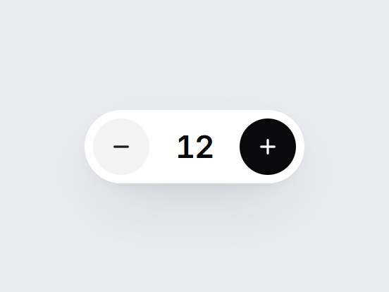
これは何か
席数や数量を選ぶ、白い pill 型のステッパーです。マイナス・数字・プラスが並び、数字は増減の向きに合わせて上下に滑ります。上限と下限ではボタンが薄くなります。範囲と刻みを差し替えて、購入画面やチーム料金の中にそのまま置けます。
TSX の全文です。アカウントは不要です。
count-stepper.tsx
"use client"; import * as React from "react";import { Minus, Plus } from "lucide-react";import { cn } from "@/lib/utils"; export type CountStepperProps = Omit< React.ComponentPropsWithoutRef<"div">, "onChange" | "defaultValue"> & { value?: number; defaultValue?: number; min?: number; max?: number; step?: number; onValueChange?: (value: number) => void; /** Accessible name, e.g. "Seats". */ ariaLabel?: string; /** Labels for the two buttons (screen readers). */ decrementLabel?: string; incrementLabel?: string;}; const CSS = `@keyframes count-stepper-in-up { from { transform: translateY(70%); opacity: 0; filter: blur(3px); } to { transform: translateY(0); opacity: 1; filter: blur(0); } }@keyframes count-stepper-in-down { from { transform: translateY(-70%); opacity: 0; filter: blur(3px); } to { transform: translateY(0); opacity: 1; filter: blur(0); } }@keyframes count-stepper-out-up { from { transform: translateY(0); opacity: 1; } to { transform: translateY(-70%); opacity: 0; filter: blur(3px); } }@keyframes count-stepper-out-down { from { transform: translateY(0); opacity: 1; } to { transform: translateY(70%); opacity: 0; filter: blur(3px); } }.count-stepper-digit { grid-area: 1 / 1; animation-duration: 420ms; animation-timing-function: cubic-bezier(0.22, 1, 0.36, 1); animation-fill-mode: both; }@media (prefers-reduced-motion: reduce) { .count-stepper-digit { animation: none !important; } .count-stepper-digit[data-leaving] { display: none; }}`; function clamp(n: number, min: number, max: number) { return Math.min(max, Math.max(min, n));} export const CountStepper = React.forwardRef<HTMLDivElement, CountStepperProps>( ( { value, defaultValue = 4, min = 0, max = 99, step = 1, onValueChange, ariaLabel = "Seats", decrementLabel = "Decrease", incrementLabel = "Increase", className, ...props }, ref, ) => { const [uncontrolled, setUncontrolled] = React.useState(() => clamp(defaultValue, min, max), ); const current = clamp(value ?? uncontrolled, min, max); // Track the outgoing number during render so the swap starts on the same frame. const [reel, setReel] = React.useState<{ value: number; prev: number | null; direction: "up" | "down"; key: number; }>({ value: current, prev: null, direction: "up", key: 0 }); if (reel.value !== current) { setReel({ value: current, prev: reel.value, direction: current > reel.value ? "up" : "down", key: reel.key + 1, }); } const commit = (next: number) => { const bounded = clamp(next, min, max); if (bounded === current) return; if (value === undefined) setUncontrolled(bounded); onValueChange?.(bounded); }; const onKeyDown = (event: React.KeyboardEvent<HTMLDivElement>) => { const map: Record<string, number | undefined> = { ArrowUp: current + step, ArrowRight: current + step, ArrowDown: current - step, ArrowLeft: current - step, PageUp: current + step * 10, PageDown: current - step * 10, Home: min, End: max, }; const next = map[event.key]; if (next === undefined) return; event.preventDefault(); commit(next); }; const atMin = current <= min; const atMax = current >= max; const buttonClass = cn( "grid size-10 shrink-0 cursor-pointer place-items-center rounded-full border-0 bg-zinc-100 text-zinc-900", "transition-[background-color,transform,opacity] duration-300 motion-reduce:transition-none", "hover:bg-zinc-200 active:scale-90 motion-reduce:active:scale-100", "focus-visible:outline-none focus-visible:ring-2 focus-visible:ring-zinc-900/35 focus-visible:ring-offset-2", "disabled:cursor-not-allowed disabled:opacity-35 disabled:hover:bg-zinc-100 disabled:active:scale-100", ); return ( <div ref={ref} data-tsuna-id="count-stepper" className={cn( "inline-flex items-center gap-1 rounded-full bg-white p-[6px]", "shadow-[0_18px_40px_-18px_rgba(15,23,42,0.28),0_4px_12px_-8px_rgba(15,23,42,0.14)]", className, )} {...props} > <style>{CSS}</style> <button type="button" className={buttonClass} onClick={() => commit(current - step)} disabled={atMin} aria-label={decrementLabel} tabIndex={-1} > <Minus className="size-4" strokeWidth={2.4} aria-hidden /> </button> <div role="spinbutton" tabIndex={0} aria-label={ariaLabel} aria-valuenow={current} aria-valuemin={min} aria-valuemax={max} onKeyDown={onKeyDown} className={cn( "grid h-10 min-w-[3.5rem] place-items-center overflow-hidden rounded-xl px-2", "text-[22px] leading-none font-semibold tabular-nums tracking-[-0.03em] text-zinc-950", "focus-visible:outline-none focus-visible:ring-2 focus-visible:ring-zinc-900/35", )} > {reel.prev !== null ? ( <span key={`out-${reel.key}`} aria-hidden data-leaving="" className="count-stepper-digit" style={{ animationName: `count-stepper-out-${reel.direction}` }} onAnimationEnd={() => { const done = reel.key; setReel((cur) => (cur.key === done ? { ...cur, prev: null } : cur)); }} > {reel.prev} </span> ) : null} <span key={`in-${reel.key}`} className="count-stepper-digit" style={ reel.key > 0 ? { animationName: `count-stepper-in-${reel.direction}` } : undefined } > {current} </span> </div> <button type="button" className={cn(buttonClass, "bg-zinc-950 text-white hover:bg-zinc-800 disabled:hover:bg-zinc-950")} onClick={() => commit(current + step)} disabled={atMax} aria-label={incrementLabel} tabIndex={-1} > <Plus className="size-4" strokeWidth={2.4} aria-hidden /> </button> </div> ); },); CountStepper.displayName = "CountStepper";

コンポーネント
カウントステッパー
席数や数量を選ぶ、白い pill 型のステッパーです。マイナス・数字・プラスが並び、数字は増減の向きに合わせて上下に滑ります。上限と下限ではボタンが薄くなります。範囲と刻みを差し替えて、購入画面やチーム料金の中にそのまま置けます。
Verified Technical Spec
- アニメーション
- CSS / Tailwind
- Reduced motion
- 確認済み
- キーボードフォーカス
- 確認済み
- 対応環境
- Tailwind CSS v3.4 + v4 · React 19 / Next.js 15 App Router + Vite / Remix 対応
含まれるもの
- ソースを Cursor / Claude に渡してエージェントに組み込める
- React · TypeScript · Tailwind CSS · Lucide の完成 UI
依存パッケージ
- React 19.0.0
- Typescript 5.7.2
- Tailwindcss 3.4.16
- Lucide-react 1.23.0
技術スタック
- React
- TypeScript
- Tailwind CSS
- Lucide
バージョン 1.0.0