DesignLayer
Theme Mode Switch
Back to components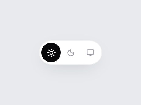
What is this?
A compact header switch for Light, Dark, and System, drawn as three icons in a pill. A round thumb slides to the chosen mode, and the whole pill turns dark when Dark is picked. It only reports the choice, so wire it to your own theme provider. Swap the labels or icons, then drop it into a header or settings menu.

Component
Theme Mode Switch
A compact header switch for Light, Dark, and System, drawn as three icons in a pill. A round thumb slides to the chosen mode, and the whole pill turns dark when Dark is picked. It only reports the choice, so wire it to your own theme provider. Swap the labels or icons, then drop it into a header or settings menu.
Checking access…
Live PreviewVerified Technical Spec
- Animation
- CSS / Tailwind
- Reduced motion
- Verified
- Keyboard focus
- Verified
- Compatibility
- Tailwind CSS v3.4 + v4 · React 19 / Next.js 15 App Router + Vite / Remix compatible
Included
- Copy source into Cursor or Claude for agent install
- Finished React · TypeScript · Tailwind CSS · Lucide UI
Dependencies
- React 19.0.0
- Typescript 5.7.2
- Tailwindcss 3.4.16
- Lucide-react 1.23.0
Tech Stack
- React
- TypeScript
- Tailwind CSS
- Lucide
Version 1.0.0