DesignLayer
Progress Steps
Back to components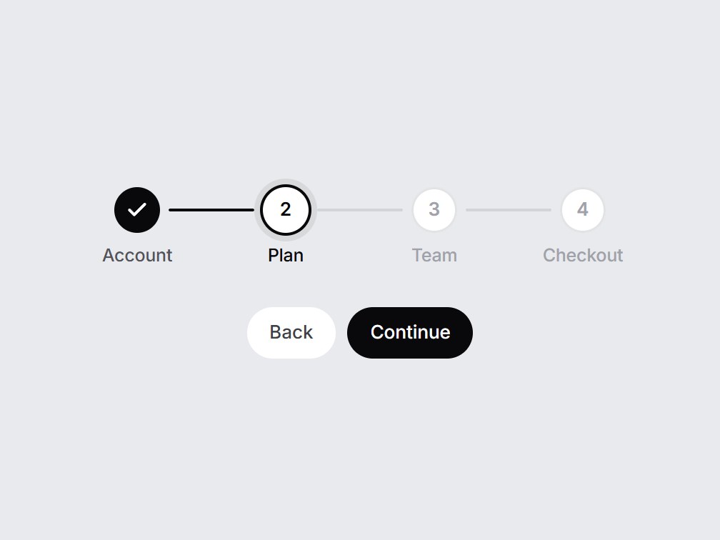
What is this?
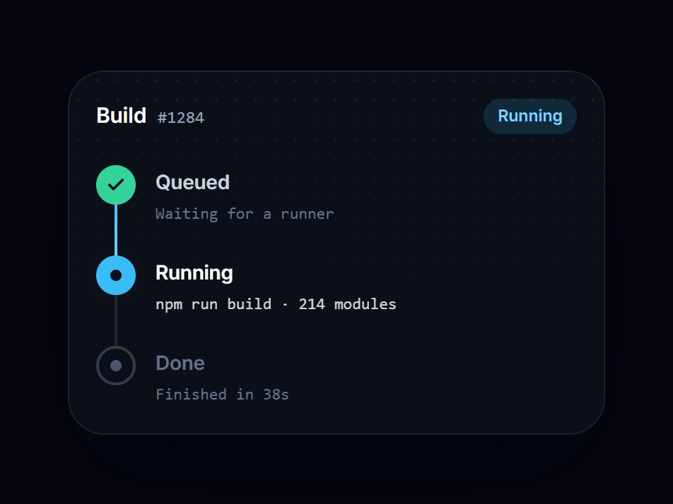
A horizontal step indicator for 3 to 5 steps, such as Account, Plan, and Checkout. The line between steps fills as you move on, finished steps turn into checks, and the current one gets a ring. Pass onStepClick to let people jump back. Swap the steps, then drop it at the top of a signup or checkout flow.

Component
Progress Steps
A horizontal step indicator for 3 to 5 steps, such as Account, Plan, and Checkout. The line between steps fills as you move on, finished steps turn into checks, and the current one gets a ring. Pass onStepClick to let people jump back. Swap the steps, then drop it at the top of a signup or checkout flow.
Checking access…
Live PreviewVerified Technical Spec
- Animation
- CSS / Tailwind
- Reduced motion
- Verified
- Keyboard focus
- Verified
- Compatibility
- Tailwind CSS v3.4 + v4 · React 19 / Next.js 15 App Router + Vite / Remix compatible
Included
- Copy source into Cursor or Claude for agent install
- Finished React · TypeScript · Tailwind CSS · Lucide UI
Dependencies
- React 19.0.0
- Typescript 5.7.2
- Tailwindcss 3.4.16
- Lucide-react 1.23.0
Tech Stack
- React
- TypeScript
- Tailwind CSS
- Lucide
Version 1.0.0