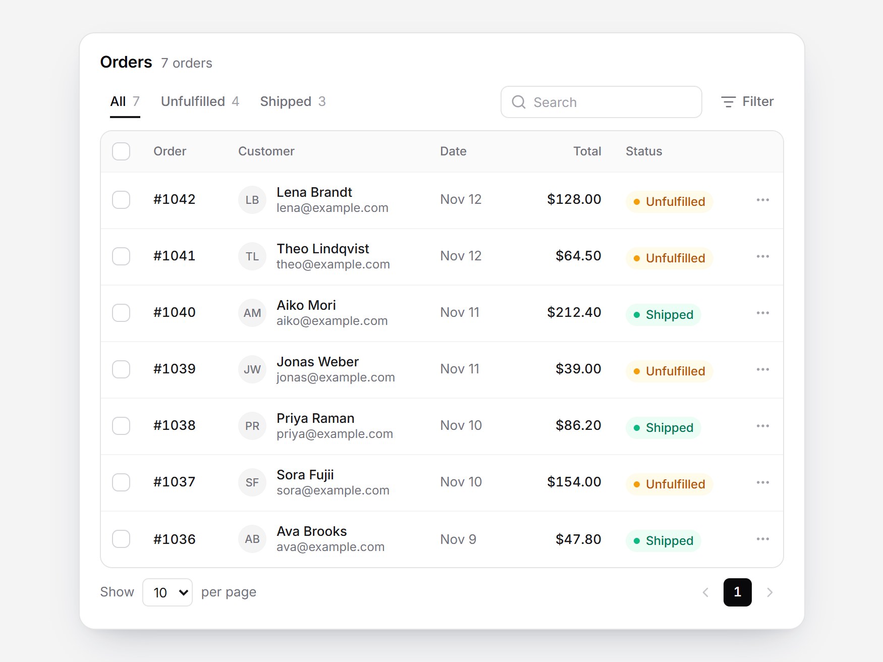
What is this?
A white orders panel. “Orders” sits beside a count, with All, Unfulfilled, and Shipped as underline tabs, plus search and Filter. The table has its own border; each customer shows initials and an email. Selecting rows crossfades the footer from “Show 10 per page” to “2 selected” and Mark as shipped. Switching tabs fades the rows and the table height follows. The header checkbox selects the visible rows and shows the indeterminate state. Swap the orders and labels, then drop it into a store admin or a fulfillment screen.
Full TSX source. No account needed.
orders-table-panel.tsx
"use client"; import * as React from "react";import { AnimatePresence, motion, useReducedMotion } from "motion/react";import { ChevronLeft, ChevronRight, ListFilter, MoreHorizontal, Search } from "lucide-react";import { cn } from "@/lib/utils"; export type OrderStatus = "unfulfilled" | "shipped"; export type OrderRow = { id: string; /** e.g. "#1042". */ number: string; customer: string; /** Defaults to firstname@example.com when omitted. */ email?: string; /** Pre-formatted, e.g. "Nov 12". */ date: string; /** Pre-formatted, e.g. "$128.00". */ total: string; status: OrderStatus;}; export type OrdersTableFilter = "all" | OrderStatus; export type OrdersTableLabels = { all?: string; unfulfilled?: string; shipped?: string; order?: string; customer?: string; date?: string; total?: string; status?: string; selected?: string; markShipped?: string; clear?: string; selectAll?: string; select?: string; orders?: string; empty?: string; search?: string; filter?: string; show?: string; perPage?: string; previous?: string; next?: string; actions?: string; pagination?: string;}; export type OrdersTablePanelProps = Omit<React.ComponentPropsWithoutRef<"div">, "title"> & { title?: string; orders?: readonly OrderRow[]; filter?: OrdersTableFilter; defaultFilter?: OrdersTableFilter; onFilterChange?: (filter: OrdersTableFilter) => void; defaultSelectedIds?: readonly string[]; onSelectionChange?: (ids: string[]) => void; /** Called once with every order id that was marked shipped. */ onMarkShipped?: (ids: string[]) => void; labels?: OrdersTableLabels;}; const LAYOUT_EASE = [0.22, 1, 0.36, 1] as const;const FOCUS = "focus-visible:outline-none focus-visible:ring-2 focus-visible:ring-zinc-900/35 focus-visible:ring-offset-2";const PAGE_SIZES = [10, 25] as const;const FILTERS: readonly OrdersTableFilter[] = ["all", "unfulfilled", "shipped"]; const DEFAULT_ORDERS: readonly OrderRow[] = [ { id: "o1042", number: "#1042", customer: "Lena Brandt", date: "Nov 12", total: "$128.00", status: "unfulfilled" }, { id: "o1041", number: "#1041", customer: "Theo Lindqvist", date: "Nov 12", total: "$64.50", status: "unfulfilled" }, { id: "o1040", number: "#1040", customer: "Aiko Mori", date: "Nov 11", total: "$212.40", status: "shipped" }, { id: "o1039", number: "#1039", customer: "Jonas Weber", date: "Nov 11", total: "$39.00", status: "unfulfilled" }, { id: "o1038", number: "#1038", customer: "Priya Raman", date: "Nov 10", total: "$86.20", status: "shipped" }, { id: "o1037", number: "#1037", customer: "Sora Fujii", date: "Nov 10", total: "$154.00", status: "unfulfilled" }, { id: "o1036", number: "#1036", customer: "Ava Brooks", date: "Nov 9", total: "$47.80", status: "shipped" },]; const DEFAULT_LABELS: Required<OrdersTableLabels> = { all: "All", unfulfilled: "Unfulfilled", shipped: "Shipped", order: "Order", customer: "Customer", date: "Date", total: "Total", status: "Status", selected: "selected", markShipped: "Mark as shipped", clear: "Clear", selectAll: "Select all orders", select: "Select order", orders: "orders", empty: "No orders here.", search: "Search", filter: "Filter", show: "Show", perPage: "per page", previous: "Previous page", next: "Next page", actions: "Actions", pagination: "Pagination",}; function emailOf(row: OrderRow) { if (row.email) return row.email; const first = row.customer.trim().split(/\s+/)[0]?.toLowerCase() || "order"; return `${first}@example.com`;} function initials(name: string) { const parts = name.trim().split(/\s+/).filter(Boolean); const first = parts[0]?.[0] ?? ""; const last = parts.length > 1 ? (parts[parts.length - 1]?.[0] ?? "") : ""; return (first + last).toUpperCase();} function pageList(current: number, count: number) { const width = 5; if (count <= width) return Array.from({ length: count }, (_, index) => index); const start = Math.min(Math.max(current - 2, 0), count - width); return Array.from({ length: width }, (_, index) => start + index);} /** A real checkbox drawn in the family style, with a dash for the indeterminate state. */function CheckBox({ checked, indeterminate, className, ...props}: Omit<React.ComponentPropsWithoutRef<"input">, "type"> & { indeterminate?: boolean }) { const box = React.useRef<HTMLInputElement>(null); React.useEffect(() => { if (box.current) box.current.indeterminate = Boolean(indeterminate); }, [indeterminate]); const filled = Boolean(checked) || Boolean(indeterminate); return ( <span className={cn("relative grid size-[18px] shrink-0 place-items-center", className)}> <input ref={box} type="checkbox" checked={checked} {...props} className={cn( "absolute inset-0 m-0 size-full cursor-pointer appearance-none rounded-md border", filled ? "border-zinc-950 bg-zinc-950" : "border-zinc-300 bg-white hover:border-zinc-400", "disabled:cursor-default disabled:opacity-50", FOCUS, )} /> <svg aria-hidden viewBox="0 0 12 12" className="pointer-events-none relative size-3 text-white"> <path d={indeterminate ? "M3 6h6" : "M2.5 6.2 5 8.6l4.5-5"} fill="none" stroke="currentColor" strokeWidth="1.8" strokeLinecap="round" strokeLinejoin="round" style={{ opacity: filled ? 1 : 0 }} /> </svg> </span> );} function StatusBadge({ shipped, label }: { shipped: boolean; label: string }) { return ( <span className={cn( "inline-flex h-[22px] select-none items-center gap-1.5 rounded-full px-2 text-[12px] font-medium", shipped ? "bg-emerald-50 text-emerald-700" : "bg-amber-50 text-amber-700", )} > <span aria-hidden className={cn("size-1.5 shrink-0 rounded-full", shipped ? "bg-emerald-500" : "bg-amber-500")} /> {label} </span> );} export const OrdersTablePanel = React.forwardRef<HTMLDivElement, OrdersTablePanelProps>( ( { title = "Orders", orders = DEFAULT_ORDERS, filter, defaultFilter = "all", onFilterChange, defaultSelectedIds = [], onSelectionChange, onMarkShipped, labels, className, ...props }, ref, ) => { const text = { ...DEFAULT_LABELS, ...labels }; const reduced = useReducedMotion() === true; const uid = React.useId(); const [rows, setRows] = React.useState<OrderRow[]>(() => orders.map((order) => ({ ...order }))); const [ownFilter, setOwnFilter] = React.useState<OrdersTableFilter>(defaultFilter); const active = filter ?? ownFilter; const [selected, setSelected] = React.useState<readonly string[]>(defaultSelectedIds); const [query, setQuery] = React.useState(""); const [page, setPage] = React.useState(0); const [pageSize, setPageSize] = React.useState<(typeof PAGE_SIZES)[number]>(10); const [announce, setAnnounce] = React.useState(""); const [bodyHeight, setBodyHeight] = React.useState<number | null>(null); const bodyRef = React.useRef<HTMLDivElement>(null); const hasMeasured = React.useRef(false); const tabButtons = React.useRef<Partial<Record<OrdersTableFilter, HTMLButtonElement | null>>>({}); const needle = query.trim().toLowerCase(); const searched = needle ? rows.filter((row) => [row.number, row.customer, emailOf(row), row.date, row.total].join("\n").toLowerCase().includes(needle), ) : rows; const matched = searched.filter((row) => active === "all" || row.status === active); const pageCount = Math.max(1, Math.ceil(matched.length / pageSize)); const safePage = Math.min(page, pageCount - 1); const pageRows = matched.slice(safePage * pageSize, safePage * pageSize + pageSize); const pageIds = pageRows.map((row) => row.id); const picked = selected.filter((id) => matched.some((row) => row.id === id)); const pagePicked = pageIds.filter((id) => picked.includes(id)); const allPicked = pageIds.length > 0 && pagePicked.length === pageIds.length; const somePicked = pagePicked.length > 0 && !allPicked; const actionable = rows.filter((row) => picked.includes(row.id) && row.status === "unfulfilled"); const instantHeight = reduced || bodyHeight === null || !hasMeasured.current; if (bodyHeight !== null) hasMeasured.current = true; React.useLayoutEffect(() => { const node = bodyRef.current; if (!node) return; const measure = () => { const next = node.offsetHeight; setBodyHeight((prev) => (prev === next ? prev : next)); }; measure(); if (typeof ResizeObserver === "undefined") return; const observer = new ResizeObserver(measure); observer.observe(node); return () => observer.disconnect(); }, []); const select = (next: readonly string[]) => { setSelected(next); onSelectionChange?.([...next]); }; const chooseFilter = (next: OrdersTableFilter, focus = false) => { setPage(0); if (filter === undefined) setOwnFilter(next); onFilterChange?.(next); if (focus) tabButtons.current[next]?.focus(); }; const onTabKeyDown = (event: React.KeyboardEvent) => { const index = FILTERS.indexOf(active); let next: number | null = null; if (event.key === "ArrowRight") next = (index + 1) % FILTERS.length; if (event.key === "ArrowLeft") next = (index - 1 + FILTERS.length) % FILTERS.length; if (next === null) return; event.preventDefault(); chooseFilter(FILTERS[next] ?? "all", true); }; const markShipped = () => { const ids = actionable.map((row) => row.id); if (ids.length === 0) return; setRows((current) => current.map((row) => (ids.includes(row.id) ? { ...row, status: "shipped" } : row))); select(selected.filter((id) => !ids.includes(id))); setAnnounce(`${ids.length} ${text.shipped}`); onMarkShipped?.(ids); }; const count = (which: OrdersTableFilter) => searched.filter((row) => which === "all" || row.status === which).length; const filterLabel: Record<OrdersTableFilter, string> = { all: text.all, unfulfilled: text.unfulfilled, shipped: text.shipped, }; const rowMotion = (index: number) => ({ duration: reduced ? 0 : 0.15, delay: reduced ? 0 : index * 0.015, ease: LAYOUT_EASE, }); return ( <div ref={ref} data-tsuna-id="orders-table-panel" data-selected={picked.length} className={cn( "relative w-[720px] max-w-full overflow-clip rounded-2xl border border-zinc-200 bg-white px-5 pt-4 pb-3 text-zinc-900", "shadow-[0_18px_40px_-18px_rgba(15,23,42,0.28),0_4px_12px_-8px_rgba(15,23,42,0.14)]", className, )} {...props} > <div className="flex items-baseline gap-2"> <h2 className="m-0 text-[16px] font-semibold tracking-[-0.01em] text-zinc-950">{title}</h2> <p className="m-0 text-[13px] text-zinc-500 tabular-nums"> {rows.length} {text.orders} </p> </div> <div className="mt-3 flex flex-wrap items-center justify-between gap-3"> <div role="tablist" aria-label={text.status} onKeyDown={onTabKeyDown} className="flex items-center"> {FILTERS.map((key) => { const current = key === active; return ( <button key={key} ref={(node) => { tabButtons.current[key] = node; }} type="button" role="tab" id={`${uid}-tab-${key}`} aria-selected={current} aria-controls={`${uid}-panel`} tabIndex={current ? 0 : -1} onClick={() => chooseFilter(key)} className={cn( "relative inline-flex h-8 cursor-pointer items-center gap-1.5 border-0 bg-transparent px-2.5 text-[13px] font-medium", current ? "text-zinc-950" : "text-zinc-500 hover:text-zinc-800", FOCUS, )} > {filterLabel[key]} <span className="text-[13px] font-normal text-zinc-400 tabular-nums">{count(key)}</span> {current ? ( <motion.span layoutId={`${uid}-underline`} aria-hidden className="absolute inset-x-2.5 bottom-0 h-0.5 bg-zinc-900" transition={reduced ? { duration: 0 } : { type: "spring", stiffness: 520, damping: 42 }} /> ) : null} </button> ); })} </div> <div className="flex items-center gap-2"> <label className="relative block"> <span className="sr-only">{text.search}</span> <Search aria-hidden className="pointer-events-none absolute top-1/2 left-2.5 size-4 -translate-y-1/2 text-zinc-400" /> <input type="text" value={query} placeholder={text.search} onChange={(event) => { setQuery(event.target.value); setPage(0); }} className={cn( "h-8 w-[200px] rounded-lg border border-zinc-200 bg-white pr-2.5 pl-8 text-[13px] text-zinc-900 outline-none placeholder:text-zinc-400", FOCUS, )} /> </label> <button type="button" className={cn( "inline-flex h-8 cursor-pointer items-center gap-1.5 rounded-lg border-0 bg-transparent px-2.5 text-[13px] font-medium text-zinc-500", "hover:bg-zinc-100 hover:text-zinc-900", FOCUS, )} > <ListFilter aria-hidden className="size-4" /> {text.filter} </button> </div> </div> <motion.div initial={false} animate={bodyHeight === null ? { height: "auto" } : { height: bodyHeight }} transition={instantHeight ? { duration: 0 } : { height: { duration: 0.15, ease: LAYOUT_EASE } }} className="mt-3 box-content overflow-hidden" > <div ref={bodyRef} role="tabpanel" id={`${uid}-panel`} aria-labelledby={`${uid}-tab-${active}`} className="overflow-hidden rounded-xl border border-zinc-200" > <table className="w-full table-fixed border-collapse text-left"> <colgroup> <col className="w-10" /> <col className="w-[84px]" /> <col /> <col className="w-[88px]" /> <col className="w-[96px]" /> <col className="w-[128px]" /> <col className="w-10" /> </colgroup> <thead> <tr className="h-10 bg-zinc-50 text-[12px] font-medium text-zinc-500"> <th scope="col" className="px-0 text-center align-middle"> <CheckBox aria-label={text.selectAll} checked={allPicked} indeterminate={somePicked} disabled={pageRows.length === 0} onChange={() => select( allPicked ? selected.filter((id) => !pageIds.includes(id)) : [...new Set([...selected, ...pageIds])], ) } className="mx-auto" /> </th> <th scope="col" className="px-3 align-middle font-medium"> {text.order} </th> <th scope="col" className="px-3 align-middle font-medium"> {text.customer} </th> <th scope="col" className="px-3 align-middle font-medium"> {text.date} </th> <th scope="col" className="px-3 text-right align-middle font-medium"> {text.total} </th> <th scope="col" className="px-3 align-middle font-medium"> {text.status} </th> <th scope="col" className="px-0 align-middle"> <span className="sr-only">{text.actions}</span> </th> </tr> </thead> <tbody> <AnimatePresence initial={false} mode="popLayout"> {pageRows.length === 0 ? ( <motion.tr key="empty" layout="position" initial={reduced ? false : { opacity: 0 }} animate={{ opacity: 1 }} exit={{ opacity: 0 }} transition={{ opacity: rowMotion(0), layout: rowMotion(0) }} > <td colSpan={7} className="h-14 px-3 text-center align-middle text-[13px] text-zinc-400"> {text.empty} </td> </motion.tr> ) : ( pageRows.map((row, index) => { const checked = picked.includes(row.id); const shipped = row.status === "shipped"; const motionProps = rowMotion(index); return ( <motion.tr key={row.id} layout="position" data-selected={checked ? "" : undefined} initial={reduced ? false : { opacity: 0 }} animate={{ opacity: 1 }} exit={{ opacity: 0 }} transition={{ opacity: motionProps, layout: motionProps }} className={cn( "h-14 border-t border-zinc-100", checked ? "bg-zinc-50" : "hover:bg-zinc-50/70", )} > <td className="px-0 text-center align-middle"> <CheckBox aria-label={`${text.select} ${row.number}`} checked={checked} onChange={() => select(checked ? selected.filter((id) => id !== row.id) : [...selected, row.id]) } className="mx-auto" /> </td> <td className="px-3 align-middle text-[13px] font-medium text-zinc-900 tabular-nums"> {row.number} </td> <td className="px-3 align-middle"> <span className="flex min-w-0 items-center gap-2.5"> <span aria-hidden className="grid size-7 shrink-0 place-items-center rounded-full bg-zinc-100 text-[11px] font-medium text-zinc-500" > {initials(row.customer)} </span> <span className="min-w-0"> <span className="block truncate text-[13px] leading-4 font-medium text-zinc-900"> {row.customer} </span> <span className="block truncate text-[12px] leading-4 text-zinc-500">{emailOf(row)}</span> </span> </span> </td> <td className="px-3 align-middle text-[13px] text-zinc-500">{row.date}</td> <td className="px-3 text-right align-middle text-[13px] font-medium text-zinc-900 tabular-nums"> {row.total} </td> <td className="px-3 align-middle"> <StatusBadge shipped={shipped} label={shipped ? text.shipped : text.unfulfilled} /> </td> <td className="px-0 text-center align-middle"> <button type="button" aria-label={`${text.actions} ${row.number}`} className={cn( "mx-auto grid size-7 cursor-pointer place-items-center rounded-md border-0 bg-transparent text-zinc-400", "hover:bg-zinc-100 hover:text-zinc-900", FOCUS, )} > <MoreHorizontal aria-hidden className="size-4" /> </button> </td> </motion.tr> ); }) )} </AnimatePresence> </tbody> </table> </div> </motion.div> <div className="flex h-12 items-center justify-between gap-3"> <div className="grid"> <AnimatePresence initial={false}> {picked.length > 0 ? ( <motion.div key="selected" initial={reduced ? false : { opacity: 0 }} animate={{ opacity: 1 }} exit={{ opacity: 0 }} transition={{ duration: reduced ? 0 : 0.15 }} className="col-start-1 row-start-1 flex items-center gap-3" > <span className="text-[13px] font-medium text-zinc-900 tabular-nums"> {picked.length} {text.selected} </span> <button type="button" disabled={actionable.length === 0} onClick={markShipped} className={cn( "cursor-pointer border-0 bg-transparent p-0 text-[13px] font-medium text-zinc-950", "hover:text-zinc-700 disabled:cursor-default disabled:opacity-40", FOCUS, )} > {text.markShipped} </button> </motion.div> ) : ( <motion.label key="page-size" initial={reduced ? false : { opacity: 0 }} animate={{ opacity: 1 }} exit={{ opacity: 0 }} transition={{ duration: reduced ? 0 : 0.15 }} className="col-start-1 row-start-1 flex items-center gap-2 text-[13px] text-zinc-500" > <span>{text.show}</span> <select value={pageSize} aria-label={`${text.show} ${pageSize} ${text.perPage}`} onChange={(event) => { const next = Number(event.target.value); setPageSize(next === 25 ? 25 : 10); setPage(0); }} className={cn( "h-7 cursor-pointer rounded-md border border-zinc-200 bg-white px-1.5 text-[13px] text-zinc-900", FOCUS, )} > {PAGE_SIZES.map((size) => ( <option key={size} value={size}> {size} </option> ))} </select> <span>{text.perPage}</span> </motion.label> )} </AnimatePresence> </div> <nav aria-label={text.pagination} className="flex items-center gap-1"> <button type="button" aria-label={text.previous} disabled={safePage === 0} onClick={() => setPage(safePage - 1)} className={cn( "grid size-7 cursor-pointer place-items-center rounded-md border-0 bg-transparent text-zinc-500", "hover:bg-zinc-100 disabled:cursor-default disabled:opacity-40 disabled:hover:bg-transparent", FOCUS, )} > <ChevronLeft aria-hidden className="size-4" /> </button> {pageList(safePage, pageCount).map((index) => { const current = index === safePage; return ( <button key={index} type="button" aria-label={`${index + 1}`} aria-current={current ? "page" : undefined} onClick={() => setPage(index)} className={cn( "grid size-7 cursor-pointer place-items-center rounded-md border-0 text-[13px] font-medium tabular-nums", current ? "bg-zinc-950 text-white" : "bg-transparent text-zinc-500 hover:bg-zinc-100", FOCUS, )} > {index + 1} </button> ); })} <button type="button" aria-label={text.next} disabled={safePage >= pageCount - 1} onClick={() => setPage(safePage + 1)} className={cn( "grid size-7 cursor-pointer place-items-center rounded-md border-0 bg-transparent text-zinc-500", "hover:bg-zinc-100 disabled:cursor-default disabled:opacity-40 disabled:hover:bg-transparent", FOCUS, )} > <ChevronRight aria-hidden className="size-4" /> </button> </nav> </div> <span aria-live="polite" className="sr-only"> {announce} </span> </div> ); },); OrdersTablePanel.displayName = "OrdersTablePanel";
Orders Table Panel
A white orders panel. “Orders” sits beside a count, with All, Unfulfilled, and Shipped as underline tabs, plus search and Filter. The table has its own border; each customer shows initials and an email. Selecting rows crossfades the footer from “Show 10 per page” to “2 selected” and Mark as shipped. Switching tabs fades the rows and the table height follows. The header checkbox selects the visible rows and shows the indeterminate state. Swap the orders and labels, then drop it into a store admin or a fulfillment screen.
Verified Technical Spec
- Animation
- Framer Motion
- Reduced motion
- Verified
- Keyboard focus
- Verified
- Compatibility
- Tailwind CSS v3.4 + v4 · React 19 / Next.js 15 App Router + Vite / Remix compatible
Included
- Copy source into Cursor or Claude for agent install
- Finished React · TypeScript · Tailwind CSS · Motion · Lucide UI
Dependencies
- React 19.0.0
- Typescript 5.7.2
- Tailwindcss 3.4.16
- Lucide-react 1.23.0
- Motion 12.42.2
Tech Stack
- React
- TypeScript
- Tailwind CSS
- Motion
- Lucide
Version 1.0.0