Spring Toast Stack
What is this?
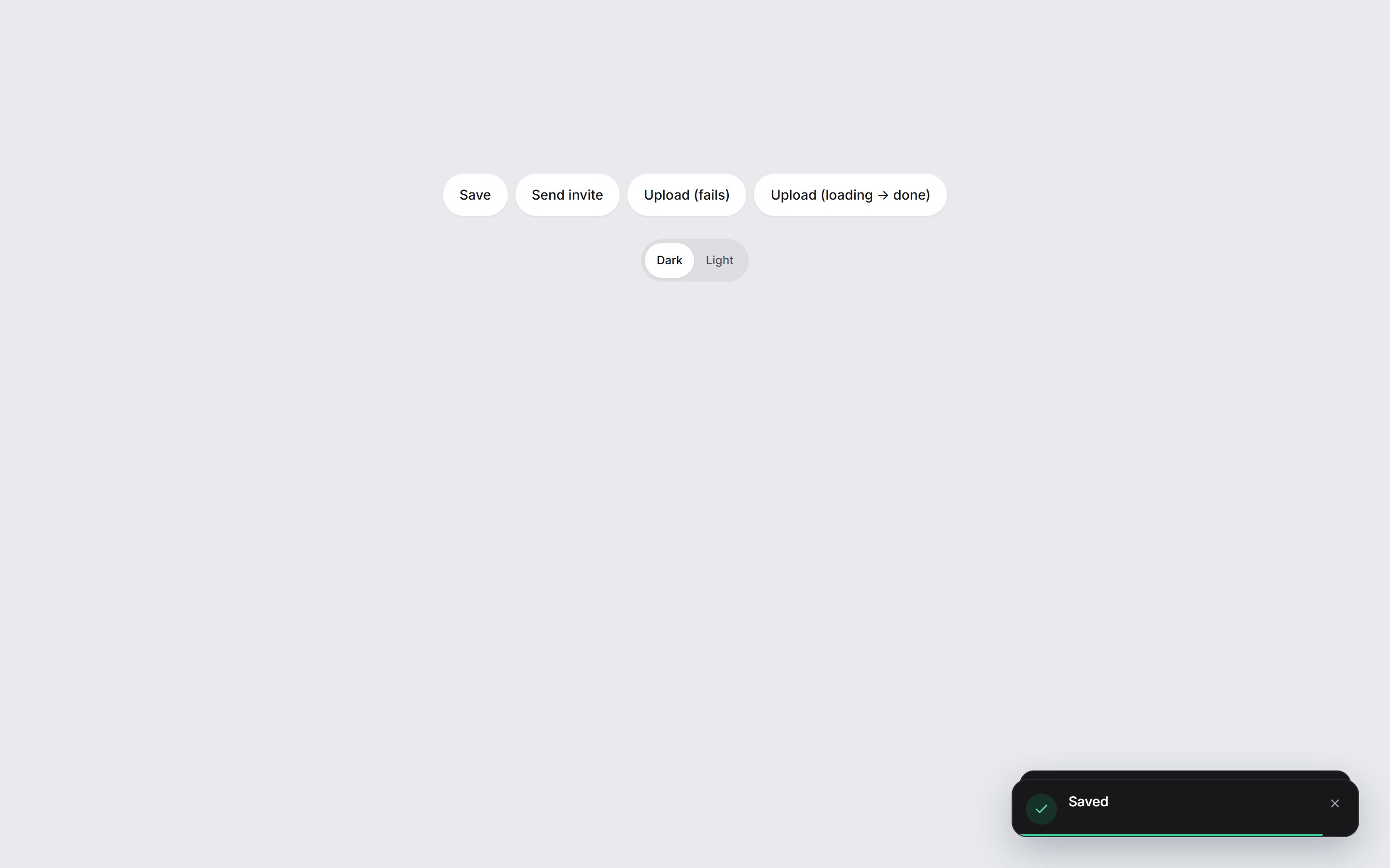
A toast stack for app feedback. Each result appears as a liquid-glass pill at the bottom-right, with a colored icon, a title, and a short line, and new toasts spring in. Swipe a card sideways to dismiss it. Success, error, and loading are included, and a loading toast can turn into success in the same card. The background is white.
Open the action from a command palette: Spring Command Palette
Use cases
- SaaS apps that confirm a save without leaving the page.
- Invite flows that need a short sent confirmation.
- Uploads that fail with a retry, or that start as loading and turn into success in the same card.
Props
| Prop | Type | Default | Description |
|---|---|---|---|
| position | "bottom-right" | "bottom-left" | "top-right" | "top-left" | "bottom-right" | Corner the stack anchors to. New toasts enter from that edge. |
| duration | number | 4800 | Milliseconds before a success or error toast dismisses itself. Loading toasts wait until they change tone. |
| maxVisible | number | 3 | How many toasts stay on screen. Older ones wait until a visible toast leaves. |
| onDismiss | (id: string) => void | — | Called with the toast id after a swipe, the close button, the timer, or dismiss(). |
| closeLabel | string | Dismiss notification | Accessible name of the close button. |
| regionLabel | string | Notifications | Accessible name of the stack region. |
| toast() | (options) => string | — | Pushes a toast and returns its id. Pass a title string, or { title, description?, tone?, duration?, id?, actionLabel?, onAction? }. tone is success, error, or loading. |
| useToast() | { toast, update, dismiss } | — | The same push, plus update(id, patch) and dismiss(id). update with the same id morphs a loading toast into success without a new card. |


Spring Toast Stack
A toast stack for app feedback. Each result appears as a liquid-glass pill at the bottom-right, with a colored icon, a title, and a short line, and new toasts spring in. Swipe a card sideways to dismiss it. Success, error, and loading are included, and a loading toast can turn into success in the same card. The background is white.
Free: 5 component copies/month & 1 video prompt/month · Unlimited on the 30-Day Pass and Lifetime
Included
- Copy source into Cursor or Claude for agent install
- Finished React · TypeScript · Tailwind CSS · Motion · Lucide UI
Dependencies
- React 19.0.0
- Typescript 5.7.2
- Tailwindcss 3.4.16
- Lucide-react 1.23.0
- Motion 12.42.2
Tech Stack
- React
- TypeScript
- Tailwind CSS
- Motion
- Lucide
Version 1.0.0