Deploy Tick Card
What is this?
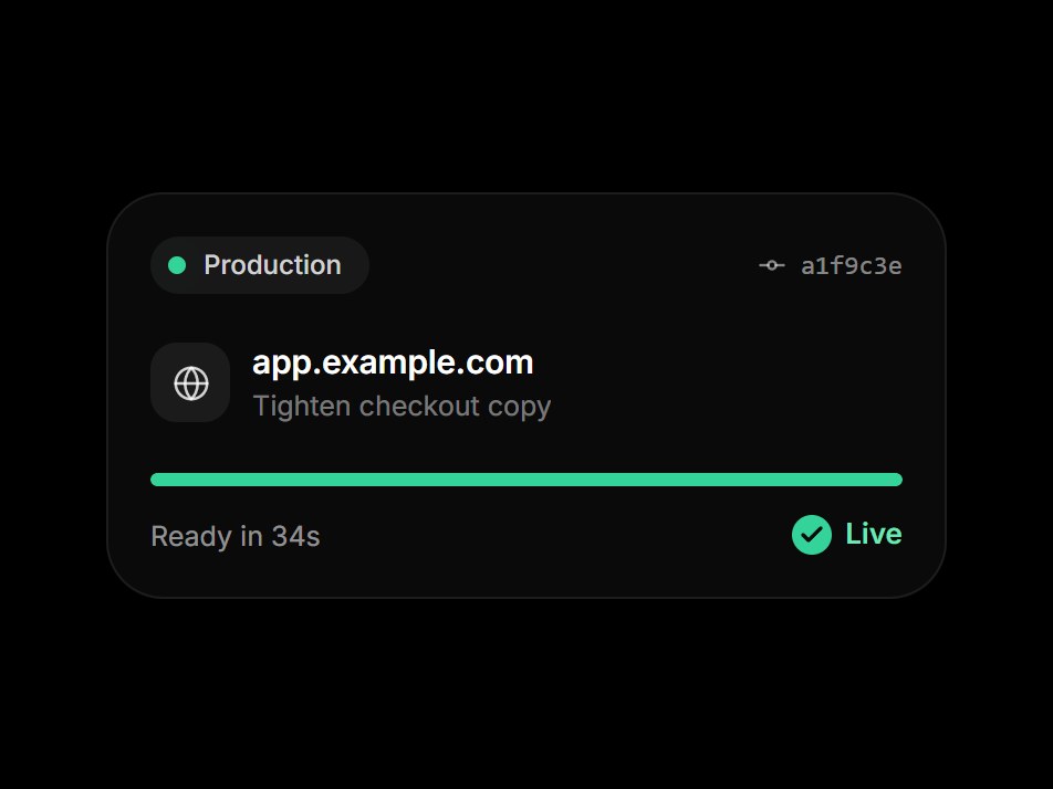
A dark deploy card with the environment, a short commit hash, the domain, and a thin progress bar. While the bar fills, the line under it steps through Building, Uploading assets, and Assigning domain. It finishes with a check and a green Live dot, then runs again. Swap the environment, commit, domain, and labels, then drop it into a hosting or DevOps feature block.
Deploy Tick Card
A dark deploy card with the environment, a short commit hash, the domain, and a thin progress bar. While the bar fills, the line under it steps through Building, Uploading assets, and Assigning domain. It finishes with a check and a green Live dot, then runs again. Swap the environment, commit, domain, and labels, then drop it into a hosting or DevOps feature block.
Verified Technical Spec
- Animation
- CSS / Tailwind
- Reduced motion
- Verified
- Keyboard focus
- Not detected in source
- Compatibility
- Tailwind CSS v3.4 + v4 · React 19 / Next.js 15 App Router + Vite / Remix compatible
Included
- Copy source into Cursor or Claude for agent install
- Finished React · TypeScript · Tailwind CSS · Lucide UI
Dependencies
- React 19.0.0
- Typescript 5.7.2
- Tailwindcss 3.4.16
- Lucide-react 1.23.0
Tech Stack
- React
- TypeScript
- Tailwind CSS
- Lucide
Version 1.0.0