Back to components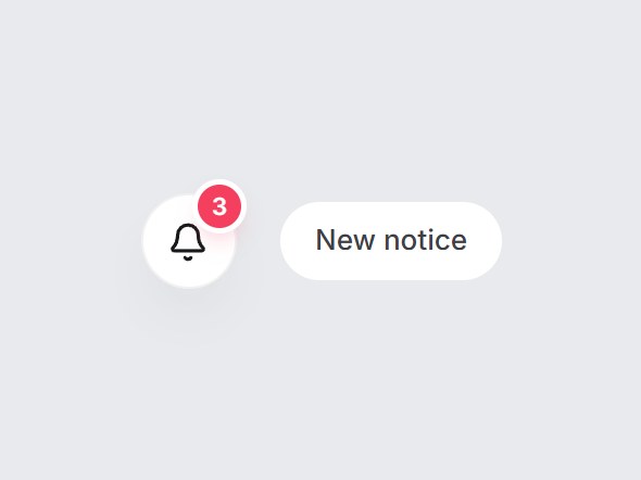
What is this?
A round bell button with a red count badge that caps at 99+. When the count goes from zero to one or more, the badge pops in and the bell swings once; later increases give it a small bump. Swap the icon, label, and cap, then drop it into an app header or a dashboard top bar.
Full TSX source. No account needed.
notice-count-badge.tsx
"use client"; import * as React from "react";import { Bell, type LucideIcon } from "lucide-react";import { cn } from "@/lib/utils"; export type NoticeCountBadgeProps = Omit< React.ComponentPropsWithoutRef<"button">, "type" | "children"> & { /** Unread count. 0 hides the badge. */ count: number; /** Above this the badge reads `${max}+`. */ max?: number; /** Accessible name, e.g. "Notifications" or "Inbox". */ label?: string; /** Swap the bell for another lucide icon (Inbox, Mail…). */ icon?: LucideIcon;}; const CSS = `@keyframes notice-count-badge-pop { 0% { transform: scale(0); } 55% { transform: scale(1.22); } 100% { transform: scale(1); } }@keyframes notice-count-badge-bump { 0% { transform: scale(1); } 45% { transform: scale(1.18); } 100% { transform: scale(1); } }@keyframes notice-count-badge-ring { 0% { transform: rotate(0); } 20% { transform: rotate(14deg); } 40% { transform: rotate(-11deg); } 60% { transform: rotate(7deg); } 80% { transform: rotate(-3deg); } 100% { transform: rotate(0); } }.notice-count-badge-pop { animation: notice-count-badge-pop 480ms cubic-bezier(0.22, 1, 0.36, 1) both; }.notice-count-badge-bump { animation: notice-count-badge-bump 380ms cubic-bezier(0.22, 1, 0.36, 1) both; }.notice-count-badge-ring { transform-origin: 50% 8%; animation: notice-count-badge-ring 620ms cubic-bezier(0.22, 1, 0.36, 1) both; }@media (prefers-reduced-motion: reduce) { .notice-count-badge-pop, .notice-count-badge-bump, .notice-count-badge-ring { animation: none; }}`; export const NoticeCountBadge = React.forwardRef<HTMLButtonElement, NoticeCountBadgeProps>( ({ count, max = 99, label = "Notifications", icon: Icon = Bell, className, ...props }, ref) => { const safe = Math.max(0, Math.floor(count)); const text = safe > max ? `${max}+` : String(safe); const visible = safe > 0; // Track the previous count during render so the right animation starts on the same frame. const [motion, setMotion] = React.useState<{ prev: number; kind: "pop" | "bump" | "none"; key: number; }>({ prev: safe, kind: safe > 0 ? "pop" : "none", key: 0 }); if (motion.prev !== safe) { setMotion({ prev: safe, kind: safe > 0 && motion.prev === 0 ? "pop" : safe > motion.prev ? "bump" : "none", key: motion.key + 1, }); } return ( <button ref={ref} type="button" data-tsuna-id="notice-count-badge" aria-label={visible ? `${label}, ${text} unread` : label} className={cn( "relative grid size-11 cursor-pointer place-items-center rounded-full border-0 bg-white text-zinc-900", "shadow-[0_14px_30px_-16px_rgba(15,23,42,0.4),inset_0_0_0_1px_rgba(15,23,42,0.06)]", "transition-[background-color,transform] duration-300 hover:bg-zinc-50 active:scale-95", "motion-reduce:transition-none motion-reduce:active:scale-100", "focus-visible:outline-none focus-visible:ring-2 focus-visible:ring-zinc-900/35 focus-visible:ring-offset-2 focus-visible:ring-offset-[#e8eaed]", className, )} {...props} > <style>{CSS}</style> <span key={`icon-${motion.key}`} aria-hidden className={cn("grid", motion.kind !== "none" && visible && "notice-count-badge-ring")} > <Icon className="size-[19px]" strokeWidth={2} /> </span> {visible ? ( <span key={`badge-${motion.key}`} aria-hidden className={cn( "absolute -top-1 left-[calc(100%-18px)] flex h-5 min-w-5 items-center justify-center rounded-full px-1.5", "bg-rose-500 text-[11px] leading-none font-semibold tabular-nums text-white", "shadow-[0_0_0_2.5px_#ffffff,0_6px_12px_-4px_rgba(244,63,94,0.6)]", motion.kind === "pop" && "notice-count-badge-pop", motion.kind === "bump" && "notice-count-badge-bump", )} > {text} </span> ) : null} </button> ); },); NoticeCountBadge.displayName = "NoticeCountBadge";

Component
Notice Count Badge
A round bell button with a red count badge that caps at 99+. When the count goes from zero to one or more, the badge pops in and the bell swings once; later increases give it a small bump. Swap the icon, label, and cap, then drop it into an app header or a dashboard top bar.
Verified Technical Spec
- Animation
- CSS / Tailwind
- Reduced motion
- Verified
- Keyboard focus
- Verified
- Compatibility
- Tailwind CSS v3.4 + v4 · React 19 / Next.js 15 App Router + Vite / Remix compatible
Included
- Copy source into Cursor or Claude for agent install
- Finished React · TypeScript · Tailwind CSS · Lucide UI
Dependencies
- React 19.0.0
- Typescript 5.7.2
- Tailwindcss 3.4.16
- Lucide-react 1.23.0
Tech Stack
- React
- TypeScript
- Tailwind CSS
- Lucide
Version 1.0.0