DesignLayer
Sparkline KPI Card
Back to components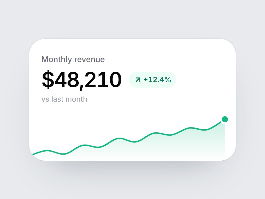
What is this?
A white KPI tile: a label, a big figure, a delta pill, and a small sparkline. When the card comes into view, the line draws itself from left to right, the area underneath fades in, and the end point pings. Swap the label, value, delta, and points, then drop it into a dashboard row or an analytics feature grid.


Component
Sparkline KPI Card
A white KPI tile: a label, a big figure, a delta pill, and a small sparkline. When the card comes into view, the line draws itself from left to right, the area underneath fades in, and the end point pings. Swap the label, value, delta, and points, then drop it into a dashboard row or an analytics feature grid.
Checking access…
Live PreviewVerified Technical Spec
- Animation
- CSS / Tailwind
- Reduced motion
- Verified
- Keyboard focus
- Not detected in source
- Compatibility
- Tailwind CSS v3.4 + v4 · React 19 / Next.js 15 App Router + Vite / Remix compatible
Included
- Copy source into Cursor or Claude for agent install
- Finished React · TypeScript · Tailwind CSS · Lucide UI
Dependencies
- React 19.0.0
- Typescript 5.7.2
- Tailwindcss 3.4.16
- Lucide-react 1.23.0
Tech Stack
- React
- TypeScript
- Tailwind CSS
- Lucide
Version 1.0.0