Back to components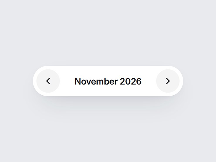
What is this?
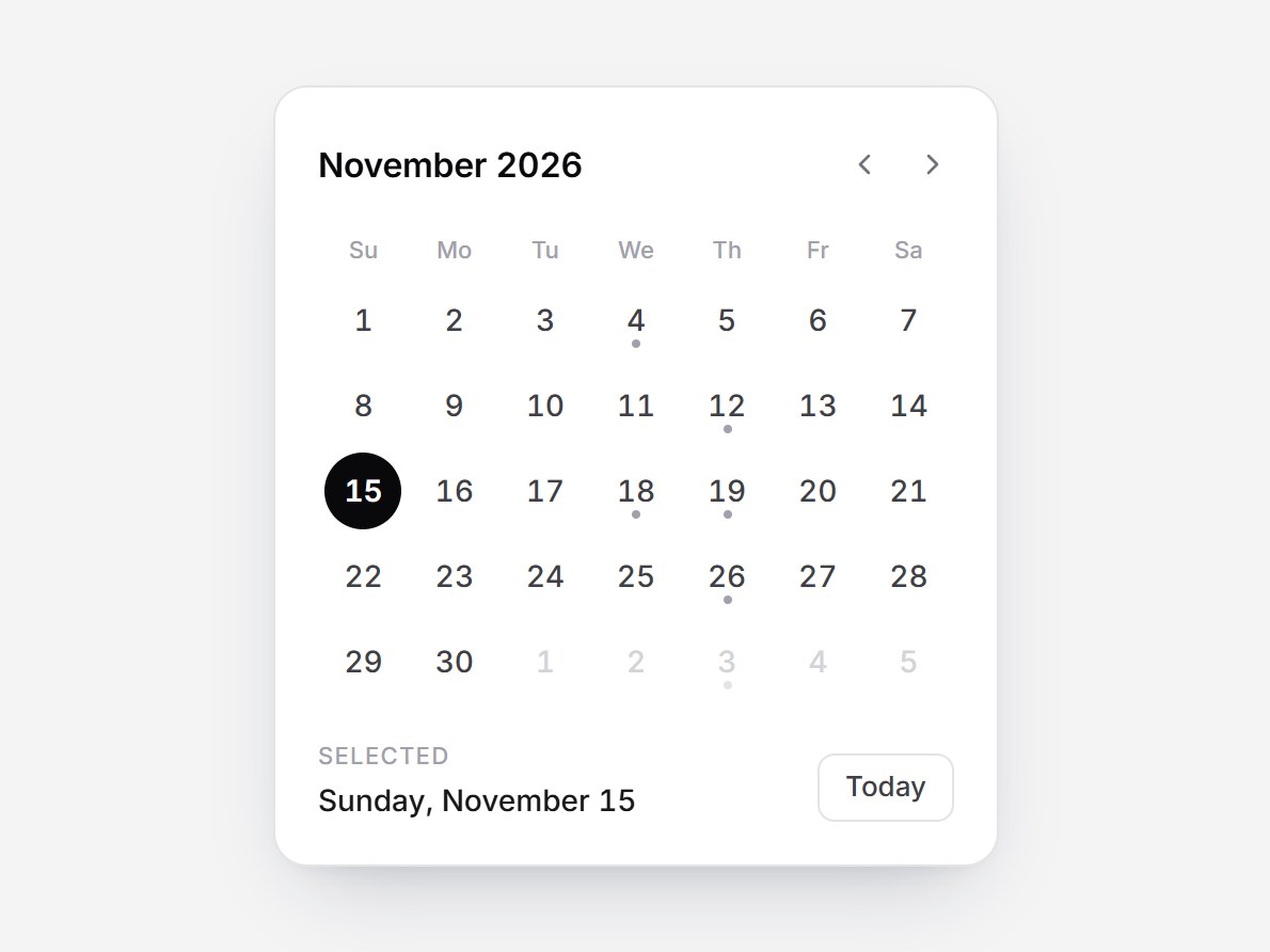
A white pill month pager: previous, the month and year, next. Changing the month slides the label sideways in the direction you moved, and each button dims at its limit. Swap the range and locale, then drop it above a calendar, billing history, or a report.
Full TSX source. No account needed.
month-pager.tsx
"use client"; import * as React from "react";import { ChevronLeft, ChevronRight } from "lucide-react";import { cn } from "@/lib/utils"; /** A calendar month. `month` is 1–12. */export type MonthPagerValue = { year: number; month: number }; export type MonthPagerProps = Omit< React.ComponentPropsWithoutRef<"div">, "onChange" | "defaultValue"> & { value?: MonthPagerValue; /** Defaults to the current month. */ defaultValue?: MonthPagerValue; onValueChange?: (value: MonthPagerValue) => void; min?: MonthPagerValue; max?: MonthPagerValue; /** BCP 47 locale for the month name, e.g. "en-US" or "ja-JP". */ locale?: string; previousLabel?: string; nextLabel?: string; /** Accessible name for the month readout. */ ariaLabel?: string;}; const CSS = `@keyframes month-pager-in-next { from { transform: translateX(70%); opacity: 0; filter: blur(3px); } to { transform: translateX(0); opacity: 1; filter: blur(0); } }@keyframes month-pager-in-prev { from { transform: translateX(-70%); opacity: 0; filter: blur(3px); } to { transform: translateX(0); opacity: 1; filter: blur(0); } }@keyframes month-pager-out-next { from { transform: translateX(0); opacity: 1; } to { transform: translateX(-70%); opacity: 0; filter: blur(3px); } }@keyframes month-pager-out-prev { from { transform: translateX(0); opacity: 1; } to { transform: translateX(70%); opacity: 0; filter: blur(3px); } }.month-pager-label { grid-area: 1 / 1; white-space: nowrap; animation-duration: 420ms; animation-timing-function: cubic-bezier(0.22, 1, 0.36, 1); animation-fill-mode: both; }@media (prefers-reduced-motion: reduce) { .month-pager-label { animation: none !important; } .month-pager-label[data-leaving] { display: none; }}`; const toIndex = (v: MonthPagerValue) => v.year * 12 + (v.month - 1);const fromIndex = (i: number): MonthPagerValue => ({ year: Math.floor(i / 12), month: (((i % 12) + 12) % 12) + 1,}); function thisMonth(): MonthPagerValue { const now = new Date(); return { year: now.getFullYear(), month: now.getMonth() + 1 };} export const MonthPager = React.forwardRef<HTMLDivElement, MonthPagerProps>( ( { value, defaultValue, onValueChange, min, max, locale = "en-US", previousLabel = "Previous month", nextLabel = "Next month", ariaLabel = "Month", className, ...props }, ref, ) => { const minIndex = min ? toIndex(min) : Number.NEGATIVE_INFINITY; const maxIndex = max ? toIndex(max) : Number.POSITIVE_INFINITY; const clamp = (i: number) => Math.min(maxIndex, Math.max(minIndex, i)); const [own, setOwn] = React.useState(() => toIndex(defaultValue ?? thisMonth())); const current = clamp(value ? toIndex(value) : own); const format = React.useMemo( () => new Intl.DateTimeFormat(locale, { month: "long", year: "numeric", timeZone: "UTC" }), [locale], ); const labelOf = (i: number) => { const { year, month } = fromIndex(i); return format.format(new Date(Date.UTC(year, month - 1, 1))); }; // Keep the outgoing label for one swap so both slide on the same frame. const [reel, setReel] = React.useState<{ index: number; prev: number | null; direction: "next" | "prev"; key: number; }>({ index: current, prev: null, direction: "next", key: 0 }); if (reel.index !== current) { setReel({ index: current, prev: reel.index, direction: current > reel.index ? "next" : "prev", key: reel.key + 1, }); } const commit = (next: number) => { const bounded = clamp(next); if (bounded === current) return; if (value === undefined) setOwn(bounded); onValueChange?.(fromIndex(bounded)); }; const onKeyDown = (event: React.KeyboardEvent<HTMLDivElement>) => { const map: Record<string, number | undefined> = { ArrowLeft: current - 1, ArrowDown: current - 1, ArrowRight: current + 1, ArrowUp: current + 1, PageDown: current - 12, PageUp: current + 12, Home: Number.isFinite(minIndex) ? minIndex : undefined, End: Number.isFinite(maxIndex) ? maxIndex : undefined, }; const next = map[event.key]; if (next === undefined) return; event.preventDefault(); commit(next); }; const atMin = current <= minIndex; const atMax = current >= maxIndex; const buttonClass = cn( "grid size-10 shrink-0 cursor-pointer place-items-center rounded-full border-0 bg-zinc-100 text-zinc-900", "transition-[background-color,transform,opacity] duration-300 motion-reduce:transition-none", "hover:bg-zinc-200 active:scale-90 motion-reduce:active:scale-100", "focus-visible:outline-none focus-visible:ring-2 focus-visible:ring-zinc-900/35 focus-visible:ring-offset-2", "disabled:cursor-not-allowed disabled:opacity-35 disabled:hover:bg-zinc-100 disabled:active:scale-100", ); const currentLabel = labelOf(current); return ( <div ref={ref} data-tsuna-id="month-pager" className={cn( "inline-flex items-center gap-1 rounded-full bg-white p-[6px]", "shadow-[0_18px_40px_-18px_rgba(15,23,42,0.28),0_4px_12px_-8px_rgba(15,23,42,0.14)]", className, )} {...props} > <style>{CSS}</style> <button type="button" className={buttonClass} onClick={() => commit(current - 1)} disabled={atMin} aria-label={previousLabel} tabIndex={-1} > <ChevronLeft className="size-[18px]" strokeWidth={2.4} aria-hidden /> </button> <div role="spinbutton" tabIndex={0} aria-label={ariaLabel} aria-valuenow={current} aria-valuetext={currentLabel} aria-valuemin={Number.isFinite(minIndex) ? minIndex : undefined} aria-valuemax={Number.isFinite(maxIndex) ? maxIndex : undefined} onKeyDown={onKeyDown} className={cn( "grid h-10 min-w-[9.75rem] place-items-center overflow-hidden rounded-xl px-3", "text-[15px] leading-none font-semibold tracking-[-0.015em] text-zinc-950", "focus-visible:outline-none focus-visible:ring-2 focus-visible:ring-zinc-900/35", )} > {reel.prev !== null ? ( <span key={`out-${reel.key}`} aria-hidden data-leaving="" className="month-pager-label" style={{ animationName: `month-pager-out-${reel.direction}` }} onAnimationEnd={() => { const done = reel.key; setReel((cur) => (cur.key === done ? { ...cur, prev: null } : cur)); }} > {labelOf(reel.prev)} </span> ) : null} <span key={`in-${reel.key}`} className="month-pager-label" suppressHydrationWarning style={ reel.key > 0 ? { animationName: `month-pager-in-${reel.direction}` } : undefined } > {currentLabel} </span> </div> <button type="button" className={buttonClass} onClick={() => commit(current + 1)} disabled={atMax} aria-label={nextLabel} tabIndex={-1} > <ChevronRight className="size-[18px]" strokeWidth={2.4} aria-hidden /> </button> </div> ); },); MonthPager.displayName = "MonthPager";
Component
Month Pager
A white pill month pager: previous, the month and year, next. Changing the month slides the label sideways in the direction you moved, and each button dims at its limit. Swap the range and locale, then drop it above a calendar, billing history, or a report.
Verified Technical Spec
- Animation
- CSS / Tailwind
- Reduced motion
- Verified
- Keyboard focus
- Verified
- Compatibility
- Tailwind CSS v3.4 + v4 · React 19 / Next.js 15 App Router + Vite / Remix compatible
Included
- Copy source into Cursor or Claude for agent install
- Finished React · TypeScript · Tailwind CSS · Lucide UI
Dependencies
- React 19.0.0
- Typescript 5.7.2
- Tailwindcss 3.4.16
- Lucide-react 1.23.0
Tech Stack
- React
- TypeScript
- Tailwind CSS
- Lucide
Version 1.0.0