Avatar Upload Ring
What is this?
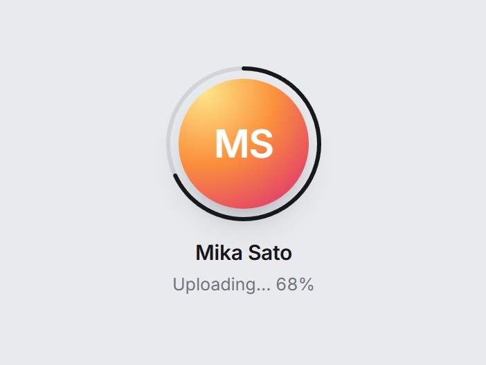
A round avatar with an optional progress ring. Hover or focus shows a camera and “Change photo”, and clicking opens the file picker and previews the picked image. The ring eases to the progress value and turns green with a check badge at 100%. Nothing is uploaded: onSelect hands you the file. Swap the photo, name, and labels, then drop it into a profile or onboarding step.



Avatar Upload Ring
A round avatar with an optional progress ring. Hover or focus shows a camera and “Change photo”, and clicking opens the file picker and previews the picked image. The ring eases to the progress value and turns green with a check badge at 100%. Nothing is uploaded: onSelect hands you the file. Swap the photo, name, and labels, then drop it into a profile or onboarding step.
Verified Technical Spec
- Animation
- CSS / Tailwind
- Reduced motion
- Verified
- Keyboard focus
- Verified
- Compatibility
- Tailwind CSS v3.4 + v4 · React 19 / Next.js 15 App Router + Vite / Remix compatible
Included
- Copy source into Cursor or Claude for agent install
- Finished React · TypeScript · Tailwind CSS · Lucide UI
Dependencies
- React 19.0.0
- Typescript 5.7.2
- Tailwindcss 3.4.16
- Lucide-react 1.23.0
Tech Stack
- React
- TypeScript
- Tailwind CSS
- Lucide
Version 1.0.0