Back to blocks
What is this?
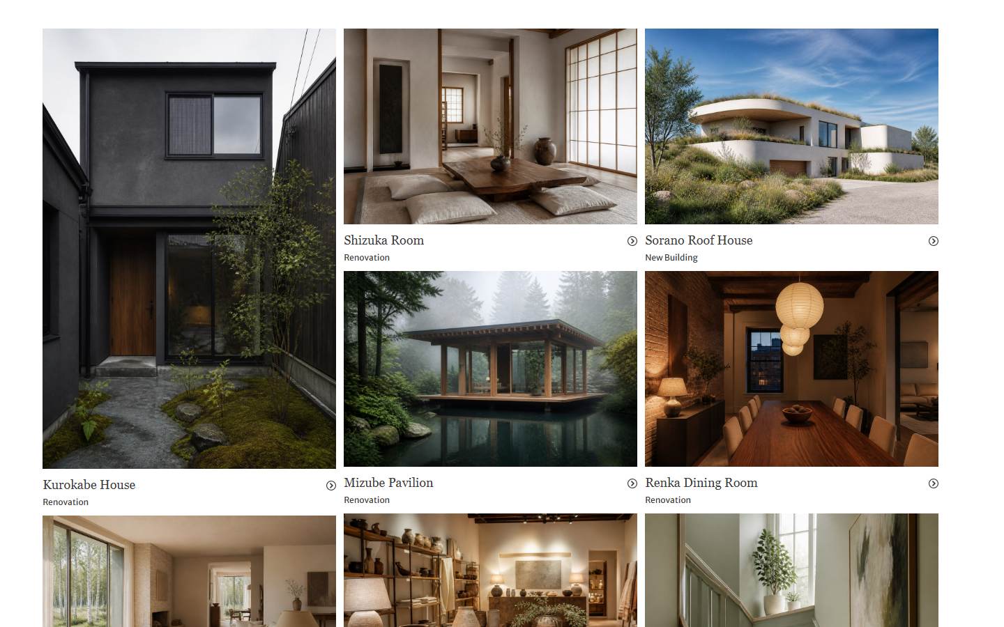
A white one-viewport sites grid with a 2×2 card layout. Each card shows a sharp website preview at rest; on hover the photo shrinks and blurs, corner dots appear, and the title, project meta (industry / year / role), and teal CTA fade in. Swap the copy and images, then drop it into a portfolio or studio works section.
Full TSX source. No account needed.
moonsworth-companies-grid.tsx
"use client"; import { useLayoutEffect } from "react";import { cn } from "@/lib/utils"; const FONT_LINK_ID = "moonsworth-companies-grid-fonts";const FONT_HREF = "https://fonts.googleapis.com/css2?family=Figtree:wght@400;500;600;700&family=Syne:wght@600;700;800&display=swap";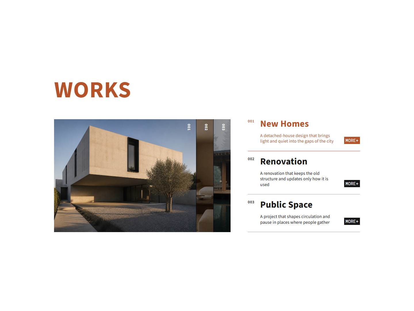

BlockPass
Moonsworth Companies Grid
A white one-viewport sites grid with a 2×2 card layout. Each card shows a sharp website preview at rest; on hover the photo shrinks and blurs, corner dots appear, and the title, project meta (industry / year / role), and teal CTA fade in. Swap the copy and images, then drop it into a portfolio or studio works section.
Checking access…
Live PreviewVerified Technical Spec
- Animation
- CSS / Tailwind
- Reduced motion
- Standard motion
- Keyboard focus
- Not detected in source
- Compatibility
- Tailwind CSS v3.4 + v4 · React 19 / Next.js 15 App Router + Vite / Remix compatible
Included
- Copy source into Cursor or Claude for agent install
- Finished React · TypeScript · Tailwind CSS UI
Dependencies
- React 19.0.0
- Typescript 5.7.2
- Tailwindcss 3.4.16
Tech Stack
- React
- TypeScript
- Tailwind CSS
Version 1.0.0