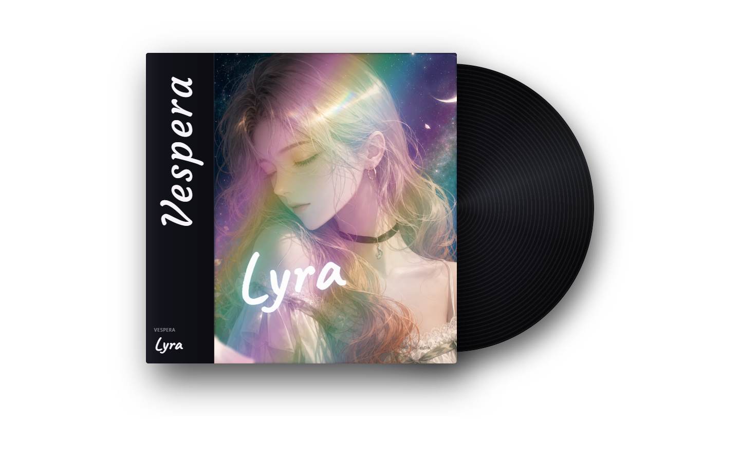
What is this?
A 16:9 editorial section that fans a full album package across the frame: a vertical obi strip, the cover art, a vinyl record spinning behind it, an oversized serif title, and a barcoded back card. Each layer drifts on its own rhythm while sparkles and a lens flare breathe. Swap the title, album name, artist, and cover image, then drop it into a music release or artwork landing page.
Full TSX source. No account needed.
album-package-showcase.tsx
"use client"; import { useEffect, useState } from "react";import { cn } from "@/lib/utils"; const FONT_LINK_ID = "album-package-showcase-fonts";const FONT_HREF = "https://fonts.googleapis.com/css2?family=Caveat:wght@700&family=Courgette&family=Playfair+Display:wght@400;500&display=swap";
Album Package Showcase
A 16:9 editorial section that fans a full album package across the frame: a vertical obi strip, the cover art, a vinyl record spinning behind it, an oversized serif title, and a barcoded back card. Each layer drifts on its own rhythm while sparkles and a lens flare breathe. Swap the title, album name, artist, and cover image, then drop it into a music release or artwork landing page.
Verified Technical Spec
- Animation
- CSS / Tailwind
- Reduced motion
- Verified
- Keyboard focus
- Not detected in source
- Compatibility
- Tailwind CSS v3.4 + v4 · React 19 / Next.js 15 App Router + Vite / Remix compatible
Included
- Copy source into Cursor or Claude for agent install
- Finished React · TypeScript · Tailwind CSS UI
Dependencies
- React 19.0.0
- Typescript 5.7.2
- Tailwindcss 3.4.16
Tech Stack
- React
- TypeScript
- Tailwind CSS
Version 1.0.0