コンポーネント一覧へ戻る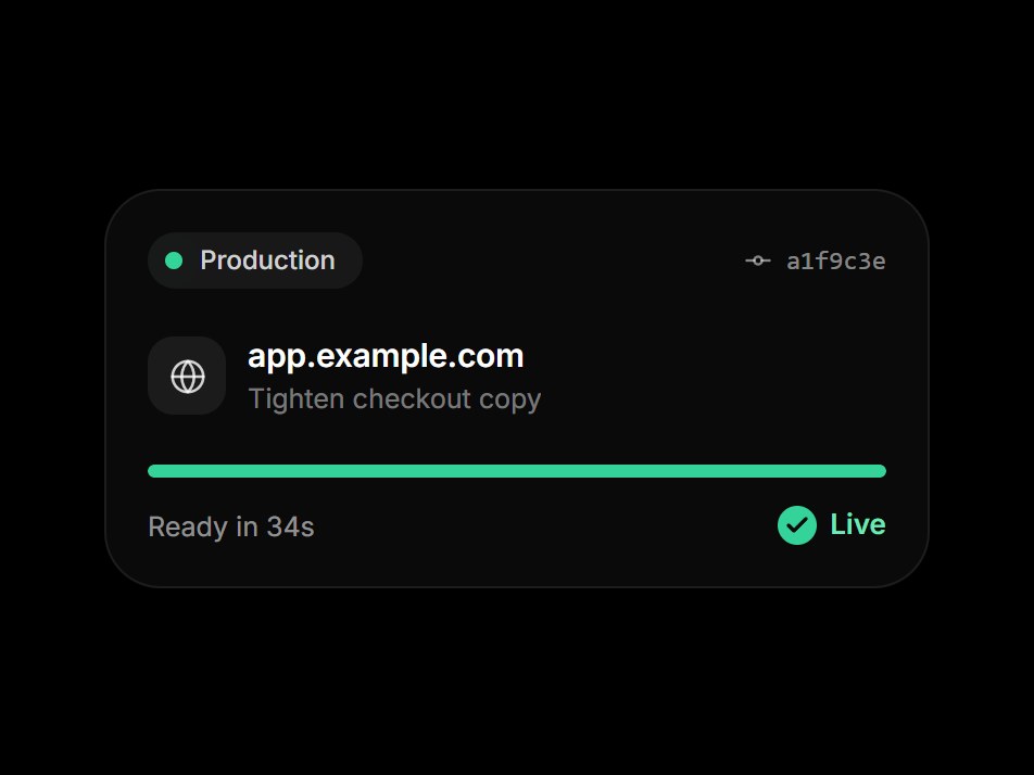
これは何か
環境名・短いコミットハッシュ・ドメイン・細い進捗バーを並べた、デプロイのダークカードです。バーが伸びる間、下の一行が Building から Assigning domain まで進みます。最後はチェックと緑の Live に変わり、もう一度始まります。環境名・コミット・ドメイン・ラベルを差し替えて、ホスティングや DevOps の機能紹介にそのまま置けます。
TSX の全文です。アカウントは不要です。
deploy-tick-card.tsx
"use client"; import * as React from "react";import { Check, GitCommitHorizontal, Globe } from "lucide-react";import { cn } from "@/lib/utils"; export type DeployTickCardProps = React.ComponentPropsWithoutRef<"div"> & { environment?: string; /** Short commit hash. */ commit?: string; /** Commit message beside the hash. */ message?: string; domain?: string; /** Status while the bar fills. */ statusLabel?: string; /** Label once the deploy is done. */ doneLabel?: string; /** Line under the bar once the deploy is done. */ doneDetail?: string; /** Steps shown one after another while the bar fills. */ steps?: readonly string[]; /** Length of the fill (ms). */ durationMs?: number; /** Run again after holding on the done state. */ loop?: boolean;}; type Phase = "reset" | "deploying" | "live"; const EASE = "cubic-bezier(0.22, 1, 0.36, 1)";const DEPLOY_TICK_DEFAULT_STEPS = ["Building", "Uploading assets", "Assigning domain"] as const; const CSS = `@keyframes deploy-tick-card-live { 0% { box-shadow: 0 0 0 0 rgba(52,211,153,0.6); } 100% { box-shadow: 0 0 0 8px rgba(52,211,153,0); } }.deploy-tick-card-live { animation: deploy-tick-card-live 1.6s cubic-bezier(0.22, 1, 0.36, 1) infinite; }@keyframes deploy-tick-card-in { from { opacity: 0; transform: translateY(4px); } to { opacity: 1; transform: none; } }@keyframes deploy-tick-card-out { from { opacity: 1; transform: none; } to { opacity: 0; transform: translateY(-4px); } }.deploy-tick-card-in { animation: deploy-tick-card-in 400ms cubic-bezier(0.22, 1, 0.36, 1) both; }.deploy-tick-card-out { animation: deploy-tick-card-out 400ms cubic-bezier(0.22, 1, 0.36, 1) both; }@media (prefers-reduced-motion: reduce) { .deploy-tick-card-live, .deploy-tick-card-in, .deploy-tick-card-out { animation: none; }}`; function useCrossfadeText(value: string, enabled: boolean) { const [state, setState] = React.useState({ current: value, outgoing: null as string | null, id: 0 }); if (value !== state.current) { const next = { current: value, outgoing: enabled ? state.current : null, id: state.id + 1, }; setState(next); return next; } return state;} function usePrefersReducedMotion() { const [reduced, setReduced] = React.useState(false); React.useEffect(() => { const query = window.matchMedia("(prefers-reduced-motion: reduce)"); const update = () => setReduced(query.matches); update(); query.addEventListener("change", update); return () => query.removeEventListener("change", update); }, []); return reduced;} function useInView<T extends Element>(ref: React.RefObject<T | null>) { const [inView, setInView] = React.useState(false); React.useEffect(() => { const node = ref.current; if (!node || typeof IntersectionObserver === "undefined") { setInView(true); return; } const observer = new IntersectionObserver(([entry]) => setInView(Boolean(entry?.isIntersecting)), { threshold: 0.25, }); observer.observe(node); return () => observer.disconnect(); }, [ref]); return inView;} export const DeployTickCard = React.forwardRef<HTMLDivElement, DeployTickCardProps>( ( { environment = "Production", commit = "a1f9c3e", message = "Tighten checkout copy", domain = "app.example.com", statusLabel = "Deploying", doneLabel = "Live", doneDetail = "Ready in 34s", steps = DEPLOY_TICK_DEFAULT_STEPS, durationMs = 3000, loop = true, className, ...props }, ref, ) => { const localRef = React.useRef<HTMLDivElement>(null); React.useImperativeHandle(ref, () => localRef.current as HTMLDivElement); const reduced = usePrefersReducedMotion(); const inView = useInView(localRef); const [phase, setPhase] = React.useState<Phase>("reset"); const [stepIndex, setStepIndex] = React.useState(0); const shown: Phase = reduced ? "live" : phase; React.useEffect(() => { if (reduced || !inView) return; let timer = 0; if (phase === "reset") { // Let the empty bar paint before the transition starts. timer = window.setTimeout(() => setPhase("deploying"), 420); } else if (phase === "deploying") { timer = window.setTimeout(() => setPhase("live"), durationMs); } else if (loop) { timer = window.setTimeout(() => setPhase("reset"), 3200); } return () => window.clearTimeout(timer); }, [phase, reduced, inView, durationMs, loop]); React.useEffect(() => { if (shown !== "deploying" || steps.length === 0) { setStepIndex(0); return; } const each = durationMs / steps.length; const timer = window.setInterval( () => setStepIndex((i) => Math.min(i + 1, steps.length - 1)), each, ); return () => window.clearInterval(timer); }, [shown, durationMs, steps.length]); const live = shown === "live"; const fill = shown === "reset" ? 0 : 1; const detail = live ? doneDetail : (steps[stepIndex] ?? statusLabel); const detailFade = useCrossfadeText(detail, !reduced); const statusSwap = "col-start-1 row-start-1 inline-flex items-center gap-1.5 transition-[opacity,transform] duration-[400ms] ease-out motion-reduce:!transition-none motion-reduce:transform-none"; return ( <div ref={localRef} data-tsuna-id="deploy-tick-card" data-phase={shown} className={cn( "w-[380px] max-w-full rounded-[26px] bg-[#0a0a0b] p-5 text-white", "shadow-[0_30px_60px_-30px_rgba(0,0,0,0.85),inset_0_0_0_1px_rgba(255,255,255,0.08)]", className, )} {...props} > <style>{CSS}</style> <div className="flex items-center justify-between"> <span className="inline-flex items-center gap-2 rounded-full bg-white/[0.06] py-1 pr-3 pl-2 text-[12px] font-medium text-white/80"> <span aria-hidden className={cn( "size-2 rounded-full transition-colors duration-500 motion-reduce:transition-none", live ? "deploy-tick-card-live bg-emerald-400" : "bg-amber-300", )} /> {environment} </span> <span className="inline-flex items-center gap-1.5 font-mono text-[12px] text-white/50"> <GitCommitHorizontal aria-hidden className="size-3.5" strokeWidth={2} /> {commit} </span> </div> <div className="mt-5 flex items-center gap-2.5"> <span className="grid size-9 shrink-0 place-items-center rounded-xl bg-white/[0.07]"> <Globe aria-hidden className="size-[17px] text-white/80" strokeWidth={1.8} /> </span> <span className="flex min-w-0 flex-col"> <span className="truncate text-[15px] font-semibold tracking-[-0.01em]">{domain}</span> <span className="truncate text-[12.5px] text-white/45">{message}</span> </span> </div> <div className="mt-5 h-1.5 overflow-hidden rounded-full bg-white/[0.08]" role="progressbar" aria-label={statusLabel} aria-valuemin={0} aria-valuemax={100} aria-valuenow={fill * 100} > <div className={cn( "h-full origin-left rounded-full motion-reduce:!transition-none", live ? "bg-emerald-400" : "bg-[linear-gradient(90deg,#fde68a,#fbbf24)]", )} style={{ transform: `scaleX(${fill})`, transition: shown === "deploying" ? `transform ${durationMs}ms cubic-bezier(0.55, 0.05, 0.25, 1), background-color 400ms ${EASE}` : shown === "live" ? `background-color 400ms ${EASE}` : "none", }} /> </div> <div className="mt-3 flex items-center justify-between"> <span className="relative h-4 min-w-0 flex-1 overflow-hidden text-[12.5px] text-white/55"> {detailFade.outgoing != null && ( <span key={`out-${detailFade.id}`} className="deploy-tick-card-out absolute inset-0 truncate"> {detailFade.outgoing} </span> )} <span key={`in-${detailFade.id}`} className={cn("absolute inset-0 truncate", detailFade.outgoing != null && "deploy-tick-card-in")} > {detailFade.current} </span> </span> <span className="inline-grid text-[13px] font-semibold"> <span className="sr-only" aria-live="polite"> {live ? doneLabel : `${statusLabel}…`} </span> <span aria-hidden className={cn( statusSwap, "text-white/70", live ? "pointer-events-none -translate-y-1 opacity-0" : "translate-y-0 opacity-100", )} > <span className="size-[18px] shrink-0 rounded-full bg-white/10" /> {statusLabel}… </span> <span aria-hidden className={cn( statusSwap, "text-emerald-300", live ? "translate-y-0 opacity-100" : "pointer-events-none translate-y-1 opacity-0", )} > <span className="grid size-[18px] shrink-0 place-items-center rounded-full bg-emerald-400 text-[#0a0a0b]"> <Check className="size-3" strokeWidth={3.4} /> </span> {doneLabel} </span> </span> </div> </div> ); },); DeployTickCard.displayName = "DeployTickCard";
コンポーネント
デプロイティックカード
環境名・短いコミットハッシュ・ドメイン・細い進捗バーを並べた、デプロイのダークカードです。バーが伸びる間、下の一行が Building から Assigning domain まで進みます。最後はチェックと緑の Live に変わり、もう一度始まります。環境名・コミット・ドメイン・ラベルを差し替えて、ホスティングや DevOps の機能紹介にそのまま置けます。
Verified Technical Spec
- アニメーション
- CSS / Tailwind
- Reduced motion
- 確認済み
- キーボードフォーカス
- ソース上では未検出
- 対応環境
- Tailwind CSS v3.4 + v4 · React 19 / Next.js 15 App Router + Vite / Remix 対応
含まれるもの
- ソースを Cursor / Claude に渡してエージェントに組み込める
- React · TypeScript · Tailwind CSS · Lucide の完成 UI
依存パッケージ
- React 19.0.0
- Typescript 5.7.2
- Tailwindcss 3.4.16
- Lucide-react 1.23.0
技術スタック
- React
- TypeScript
- Tailwind CSS
- Lucide
バージョン 1.0.0