Wordmark Panel Footer
What is this?
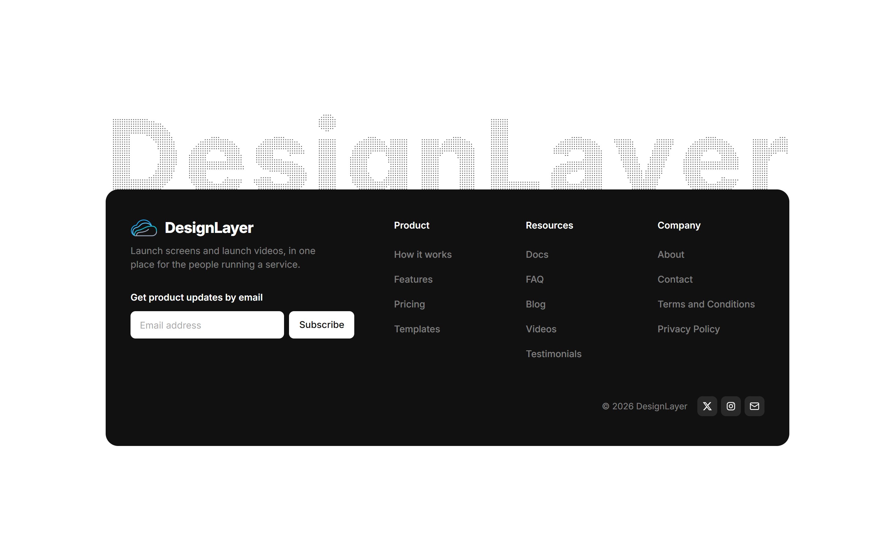
A footer on white with a huge wordmark made of evenly spaced dots, its lower edge tucked behind one black panel. The left side holds the logo, a short description, and an email signup. The right side holds three headed link columns, with small social icons beside the copyright. Moving the pointer over the letters bulges only the dots, like a sphere. Links, socials, copy, and the subscribe handler are typed props. The two sides stack on mobile. Signup goes through your own callback; no backend is included.

Wordmark Panel Footer
A footer on white with a huge wordmark made of evenly spaced dots, its lower edge tucked behind one black panel. The left side holds the logo, a short description, and an email signup. The right side holds three headed link columns, with small social icons beside the copyright. Moving the pointer over the letters bulges only the dots, like a sphere. Links, socials, copy, and the subscribe handler are typed props. The two sides stack on mobile. Signup goes through your own callback; no backend is included.
Verified Technical Spec
- Animation
- Framer Motion
- Reduced motion
- Verified
- Keyboard focus
- Verified
- Compatibility
- Tailwind CSS v3.4 + v4 · React 19 / Next.js 15 App Router + Vite / Remix compatible
Included
- Copy source into Cursor or Claude for agent install
- Responsive on phone, tablet, and desktop
- Finished React · TypeScript · Tailwind CSS · Motion UI
Dependencies
- React 19.0.0
- Typescript 5.7.2
- Tailwindcss 3.4.16
- Motion 12.42.2
Tech Stack
- React
- TypeScript
- Tailwind CSS
- Motion
Version 1.0.0