DesignLayer
Volume Pill Slider
Back to components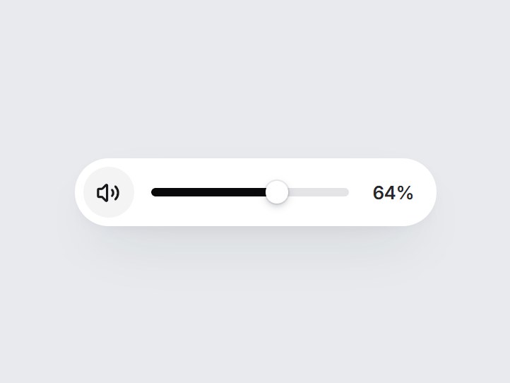
What is this?
A white pill volume control: a speaker button and a short track. The speaker mutes and unmutes, a click on the track eases the thumb to that spot, and dragging follows the pointer. Arrow keys, Home, and End work too. Swap the starting level and step, then drop it into a video player or a call screen.

Component
Volume Pill Slider
A white pill volume control: a speaker button and a short track. The speaker mutes and unmutes, a click on the track eases the thumb to that spot, and dragging follows the pointer. Arrow keys, Home, and End work too. Swap the starting level and step, then drop it into a video player or a call screen.
Checking access…
Live PreviewVerified Technical Spec
- Animation
- CSS / Tailwind
- Reduced motion
- Verified
- Keyboard focus
- Verified
- Compatibility
- Tailwind CSS v3.4 + v4 · React 19 / Next.js 15 App Router + Vite / Remix compatible
Included
- Copy source into Cursor or Claude for agent install
- Finished React · TypeScript · Tailwind CSS · Lucide UI
Dependencies
- React 19.0.0
- Typescript 5.7.2
- Tailwindcss 3.4.16
- Lucide-react 1.23.0
Tech Stack
- React
- TypeScript
- Tailwind CSS
- Lucide
Version 1.0.0