DesignLayer
Donut Share Card
Back to components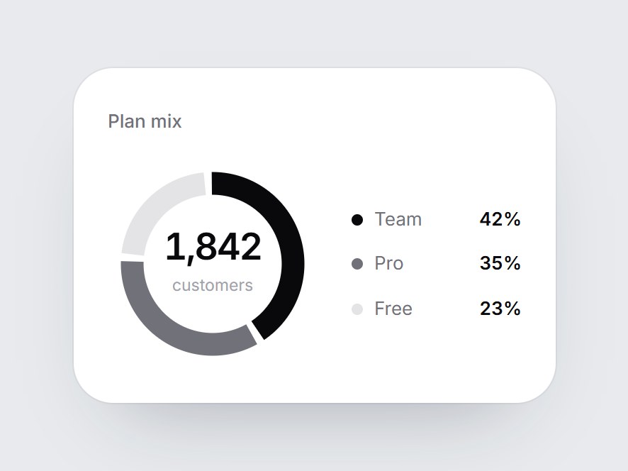
What is this?
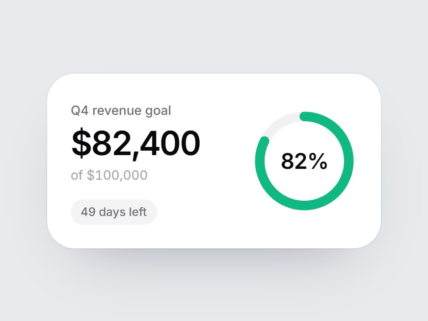
A white card with a three-segment donut, a total in the hole, and a compact legend. When the card comes into view, the ring draws clockwise from 12 o'clock, the number counts up, and the legend rows fade in. Swap the title, total, and segments, then drop it into a plan breakdown, a billing overview, or an analytics feature grid.
Component
Donut Share Card
A white card with a three-segment donut, a total in the hole, and a compact legend. When the card comes into view, the ring draws clockwise from 12 o'clock, the number counts up, and the legend rows fade in. Swap the title, total, and segments, then drop it into a plan breakdown, a billing overview, or an analytics feature grid.
Checking access…
Live PreviewVerified Technical Spec
- Animation
- CSS / Tailwind
- Reduced motion
- Verified
- Keyboard focus
- Not detected in source
- Compatibility
- Tailwind CSS v3.4 + v4 · React 19 / Next.js 15 App Router + Vite / Remix compatible
Included
- Copy source into Cursor or Claude for agent install
- Finished React · TypeScript · Tailwind CSS UI
Dependencies
- React 19.0.0
- Typescript 5.7.2
- Tailwindcss 3.4.16
Tech Stack
- React
- TypeScript
- Tailwind CSS
Version 1.0.0