Checkout Summary Panel
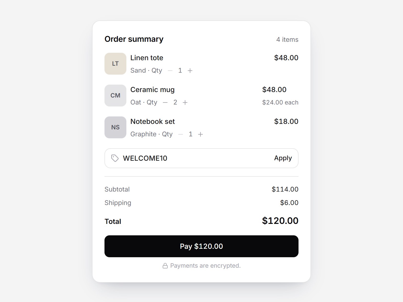
What is this?
A white checkout summary. The header shows the item count on the right of Order summary. Each item starts with an initials tile, then two lines: the name and line total, then the variant with an inline quantity stepper. Apply replaces the promo field with a code chip and adds a Discount row. Changing a quantity rolls the amounts; an invalid code shakes the field. The × on a row fades and collapses that item. Swap the items and codes, then drop it into a store cart or an order review step.
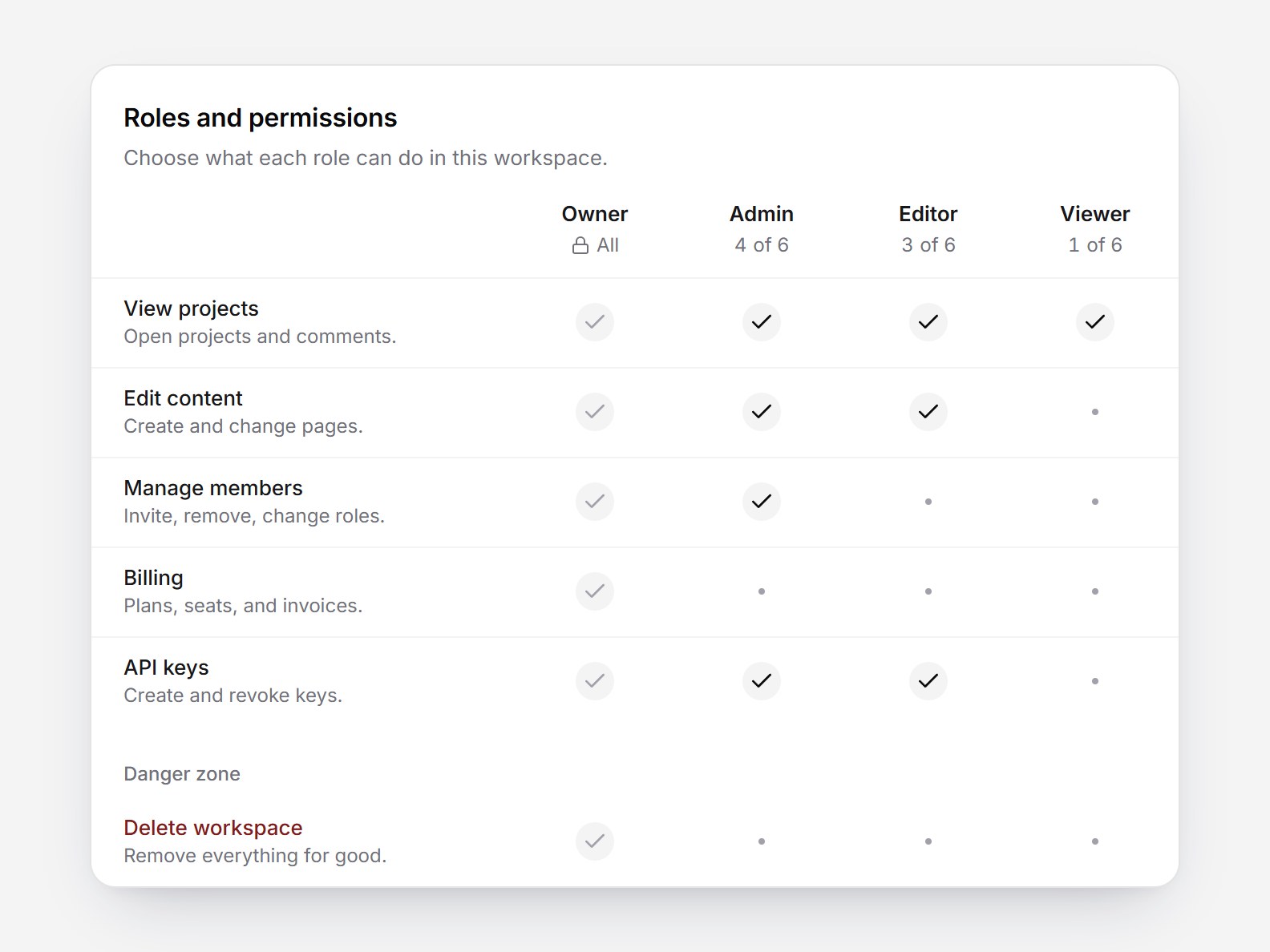
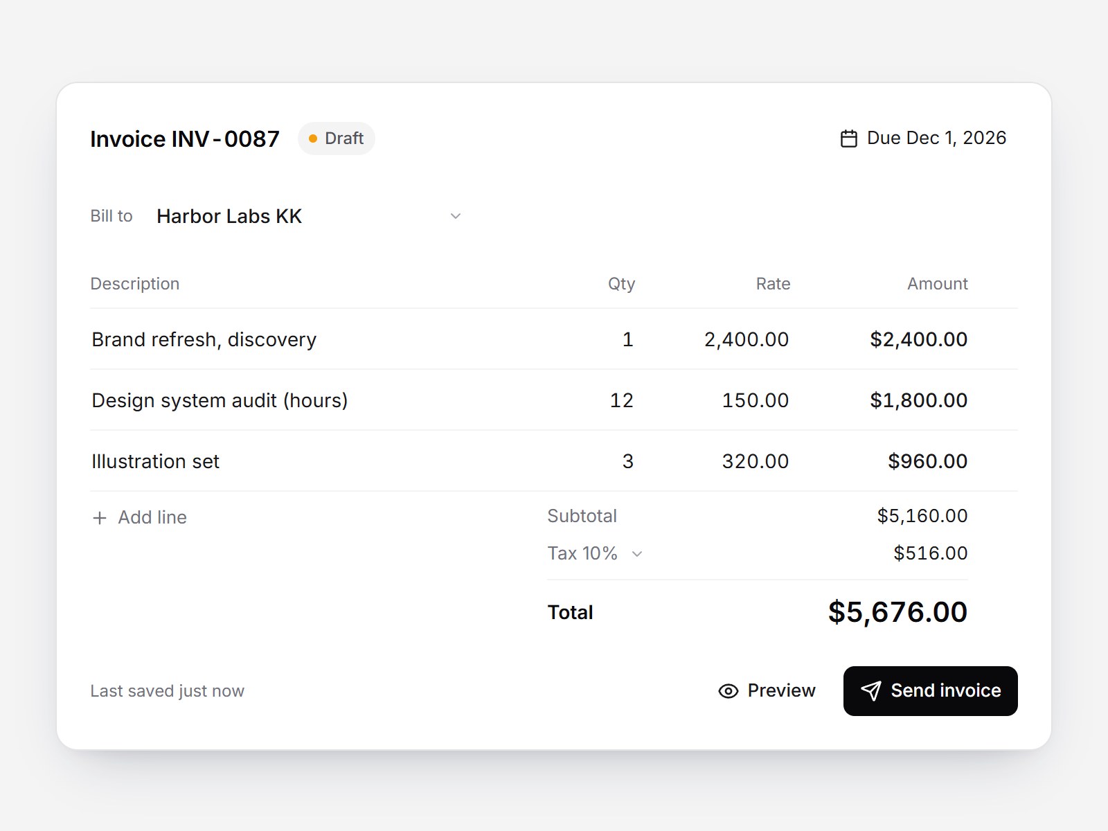


Checkout Summary Panel
A white checkout summary. The header shows the item count on the right of Order summary. Each item starts with an initials tile, then two lines: the name and line total, then the variant with an inline quantity stepper. Apply replaces the promo field with a code chip and adds a Discount row. Changing a quantity rolls the amounts; an invalid code shakes the field. The × on a row fades and collapses that item. Swap the items and codes, then drop it into a store cart or an order review step.
Verified Technical Spec
- Animation
- Framer Motion
- Reduced motion
- Verified
- Keyboard focus
- Verified
- Compatibility
- Tailwind CSS v3.4 + v4 · React 19 / Next.js 15 App Router + Vite / Remix compatible
Included
- Copy source into Cursor or Claude for agent install
- Finished React · TypeScript · Tailwind CSS · Motion · Lucide UI
Dependencies
- React 19.0.0
- Typescript 5.7.2
- Tailwindcss 3.4.16
- Lucide-react 1.23.0
- Motion 12.42.2
Tech Stack
- React
- TypeScript
- Tailwind CSS
- Motion
- Lucide
Version 1.0.0