コンポーネント一覧へ戻る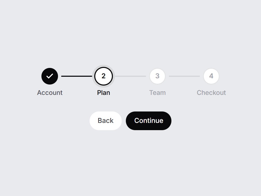
これは何か
Account・Plan・Checkout のような3〜5段階を横に並べる進捗表示です。進むと間の線が塗られ、終わった段階はチェックに変わり、今の段階には輪が付きます。onStepClick を渡すと前の段階へ戻れます。段階を差し替えて、登録や購入の流れの先頭にそのまま置けます。
TSX の全文です。アカウントは不要です。
progress-steps.tsx
"use client"; import * as React from "react";import { Check } from "lucide-react";import { cn } from "@/lib/utils"; export type ProgressStep = { id: string; label: string;}; export const PROGRESS_STEPS_DEFAULT: readonly ProgressStep[] = [ { id: "account", label: "Account" }, { id: "plan", label: "Plan" }, { id: "checkout", label: "Checkout" },]; export type ProgressStepsProps = Omit<React.ComponentPropsWithoutRef<"nav">, "onChange"> & { /** 3–5 steps read best. */ steps?: readonly ProgressStep[]; /** Zero-based index of the current step. `steps.length` marks everything done. */ current?: number; /** When set, completed steps (and the current one) become buttons. */ onStepClick?: (index: number, step: ProgressStep) => void; ariaLabel?: string;}; const EASE = "cubic-bezier(0.22, 1, 0.36, 1)"; export const ProgressSteps = React.forwardRef<HTMLElement, ProgressStepsProps>( ( { steps = PROGRESS_STEPS_DEFAULT, current = 1, onStepClick, ariaLabel = "Progress", className, ...props }, ref, ) => { const items = steps.length > 0 ? steps : PROGRESS_STEPS_DEFAULT; const active = Math.min(Math.max(current, 0), items.length); return ( <nav ref={ref} aria-label={ariaLabel} data-tsuna-id="progress-steps" className={cn("w-full max-w-[26rem] min-w-[16rem]", className)} {...props} > <ol className="m-0 flex list-none items-start p-0"> {items.map((step, i) => { const done = i < active; const isCurrent = i === active; const clickable = Boolean(onStepClick) && i <= active && i < items.length; const dot = ( <span className={cn( "relative grid size-8 place-items-center rounded-full text-[13px] font-semibold tabular-nums", "transition-[background-color,color,box-shadow] duration-500 motion-reduce:transition-none", done && "bg-zinc-950 text-white", isCurrent && "bg-white text-zinc-950 shadow-[0_0_0_2px_#09090b,0_0_0_6px_rgba(9,9,11,0.08)]", !done && !isCurrent && "bg-white text-zinc-400 shadow-[inset_0_0_0_1.5px_rgba(15,23,42,0.12)]", )} > <span aria-hidden className="col-start-1 row-start-1 motion-reduce:!transition-none" style={{ opacity: done ? 0 : 1, transform: done ? "scale(0.5)" : "scale(1)", transition: `opacity 240ms ${EASE}, transform 420ms ${EASE}`, }} > {i + 1} </span> <Check aria-hidden className="col-start-1 row-start-1 size-4 motion-reduce:!transition-none" strokeWidth={3} style={{ opacity: done ? 1 : 0, transform: done ? "scale(1) rotate(0deg)" : "scale(0.4) rotate(-30deg)", transition: `opacity 260ms ${EASE} 120ms, transform 460ms ${EASE} 120ms`, }} /> </span> ); const label = ( <span className={cn( "mt-2 block text-center text-[12.5px] leading-tight font-medium tracking-[-0.01em] transition-colors duration-300 motion-reduce:transition-none", isCurrent ? "text-zinc-950" : done ? "text-zinc-600" : "text-zinc-400", )} > {step.label} </span> ); const status = done ? "completed" : isCurrent ? "current" : "upcoming"; return ( <li key={step.id} className="relative flex min-w-0 flex-1 flex-col items-center" aria-current={isCurrent ? "step" : undefined} > {i < items.length - 1 ? ( <span aria-hidden className="absolute top-5 left-[calc(50%+22px)] h-[2px] w-[calc(100%-44px)] -translate-y-1/2 overflow-hidden rounded-full bg-zinc-900/10" > <span className="block h-full origin-left rounded-full bg-zinc-950 motion-reduce:!transition-none" style={{ transform: `scaleX(${i < active ? 1 : 0})`, transition: `transform 520ms ${EASE}`, }} /> </span> ) : null} {clickable ? ( <button type="button" onClick={() => onStepClick?.(i, step)} aria-label={`${step.label}, ${status}`} className="flex cursor-pointer flex-col items-center rounded-xl border-0 bg-transparent p-1 focus-visible:outline-none focus-visible:ring-2 focus-visible:ring-zinc-900/35" > {dot} {label} </button> ) : ( <span className="flex flex-col items-center p-1"> <span className="sr-only">{`${status}: `}</span> {dot} {label} </span> )} </li> ); })} </ol> </nav> ); },); ProgressSteps.displayName = "ProgressSteps";


コンポーネント
プログレスステップ
Account・Plan・Checkout のような3〜5段階を横に並べる進捗表示です。進むと間の線が塗られ、終わった段階はチェックに変わり、今の段階には輪が付きます。onStepClick を渡すと前の段階へ戻れます。段階を差し替えて、登録や購入の流れの先頭にそのまま置けます。
Verified Technical Spec
- アニメーション
- CSS / Tailwind
- Reduced motion
- 確認済み
- キーボードフォーカス
- 確認済み
- 対応環境
- Tailwind CSS v3.4 + v4 · React 19 / Next.js 15 App Router + Vite / Remix 対応
含まれるもの
- ソースを Cursor / Claude に渡してエージェントに組み込める
- React · TypeScript · Tailwind CSS · Lucide の完成 UI
依存パッケージ
- React 19.0.0
- Typescript 5.7.2
- Tailwindcss 3.4.16
- Lucide-react 1.23.0
技術スタック
- React
- TypeScript
- Tailwind CSS
- Lucide
バージョン 1.0.0