コンポーネント一覧へ戻る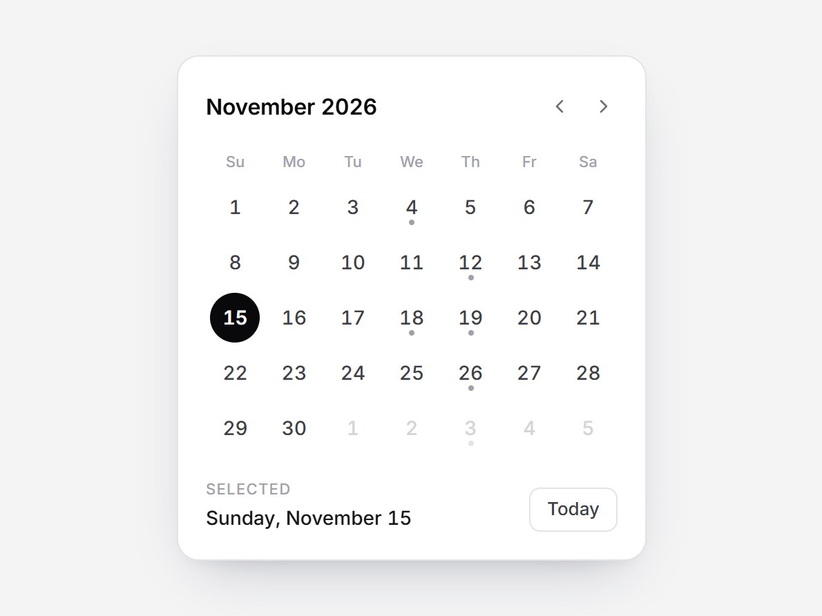
これは何か
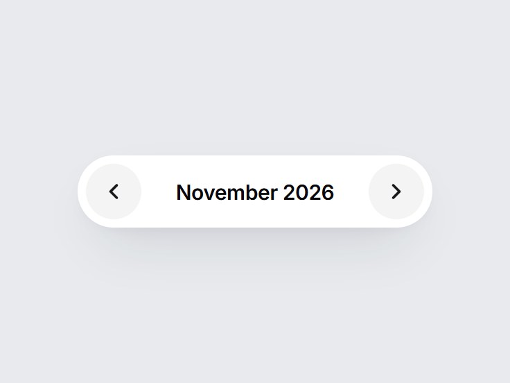
月をまるごと見せる、白いカードだけの静かなカレンダーです。上に「November 2026」と枠のない月送りの矢印、その下に曜日と、その月に必要な週だけの日付が並びます。選んだ日は黒い丸に白い数字、今日は太字と細い輪で示し、予定のある日は数字の下に小さな点が付きます。日にカーソルを置くと薄いグレーの丸が出て、月を変えると日付が少し横に滑りながら入ります。前後の月の日を押すとその月に移り、矢印キーでも日を動かせます。下に選んだ日付と小さな Today ボタンがあります。予定の日を差し替えて、予約や日程調整、ダッシュボードの横にそのまま置けます。
TSX の全文です。アカウントは不要です。
month-calendar-card.tsx
"use client"; import * as React from "react";import { ChevronLeft, ChevronRight } from "lucide-react";import { cn } from "@/lib/utils"; export type MonthCalendarLabels = { previousMonth?: string; nextMonth?: string; today?: string; selected?: string;}; export type MonthCalendarCardProps = Omit<React.ComponentPropsWithoutRef<"div">, "onChange" | "defaultValue"> & { /** Today's date as YYYY-MM-DD. Shown in bold with a faint ring, and used by the Today button. */ today?: string; /** Date selected at first, as YYYY-MM-DD. Defaults to `today`. */ defaultValue?: string; /** Dates that get a small dot under the number, as YYYY-MM-DD. */ markedDates?: readonly string[]; onChange?: (date: string) => void; labels?: MonthCalendarLabels;}; const EASE = "cubic-bezier(0.22, 1, 0.36, 1)";const FOCUS = "focus-visible:outline-none focus-visible:ring-2 focus-visible:ring-zinc-900/35 focus-visible:ring-offset-2"; const CSS = `@keyframes month-calendar-card-next { from { opacity: 0; transform: translateX(8px); } to { opacity: 1; transform: none; } }@keyframes month-calendar-card-prev { from { opacity: 0; transform: translateX(-8px); } to { opacity: 1; transform: none; } }@keyframes month-calendar-card-fade { from { opacity: 0; } to { opacity: 1; } }.month-calendar-card-next { animation: month-calendar-card-next 180ms ${EASE} both; }.month-calendar-card-prev { animation: month-calendar-card-prev 180ms ${EASE} both; }.month-calendar-card-fade { animation: month-calendar-card-fade 180ms ${EASE} both; }@media (prefers-reduced-motion: reduce) { .month-calendar-card-next, .month-calendar-card-prev, .month-calendar-card-fade { animation: none; }}`; const DEFAULT_LABELS: Required<MonthCalendarLabels> = { previousMonth: "Previous month", nextMonth: "Next month", today: "Today", selected: "Selected",}; const DEFAULT_MARKED = ["2026-11-04", "2026-11-12", "2026-11-18", "2026-11-19", "2026-11-26", "2026-12-03", "2026-12-10", "2026-12-22"]; const WEEKDAYS = ["Su", "Mo", "Tu", "We", "Th", "Fr", "Sa"];const WEEKDAYS_LONG = ["Sunday", "Monday", "Tuesday", "Wednesday", "Thursday", "Friday", "Saturday"];const MONTHS_LONG = [ "January", "February", "March", "April", "May", "June", "July", "August", "September", "October", "November", "December",];const DAY_MS = 86_400_000; /** Dates are handled in UTC so the server and the browser agree. */function parse(iso: string) { const [year, month, day] = iso.split("-").map(Number); return Date.UTC(year ?? 2026, (month ?? 1) - 1, day ?? 1);}function toIso(stamp: number) { return new Date(stamp).toISOString().slice(0, 10);}/** Month index counted from year 0, so stepping months is plain addition. */function monthOf(iso: string) { const date = new Date(parse(iso)); return date.getUTCFullYear() * 12 + date.getUTCMonth();}function monthStart(month: number) { return Date.UTC(Math.floor(month / 12), month % 12, 1);}function longDate(iso: string) { const date = new Date(parse(iso)); return `${WEEKDAYS_LONG[date.getUTCDay()]}, ${MONTHS_LONG[date.getUTCMonth()]} ${date.getUTCDate()}`;} export const MonthCalendarCard = React.forwardRef<HTMLDivElement, MonthCalendarCardProps>( ( { today = "2026-11-15", defaultValue, markedDates = DEFAULT_MARKED, onChange, labels, className, ...props }, ref, ) => { const text = { ...DEFAULT_LABELS, ...labels }; const [selected, setSelected] = React.useState(() => defaultValue ?? today); const [month, setMonth] = React.useState(() => monthOf(defaultValue ?? today)); const [direction, setDirection] = React.useState<"next" | "prev" | null>(null); const grid = React.useRef<HTMLDivElement>(null); const focusAfter = React.useRef(false); const marked = React.useMemo(() => new Set(markedDates), [markedDates]); const first = monthStart(month); const lead = new Date(first).getUTCDay(); const length = Math.round((monthStart(month + 1) - first) / DAY_MS); // Only the weeks this month needs: 4, 5 or 6 rows. const rows = Math.ceil((lead + length) / 7); const cells = Array.from({ length: rows * 7 }, (_, i) => toIso(first + (i - lead) * DAY_MS)); const monthLabel = `${MONTHS_LONG[month % 12]} ${Math.floor(month / 12)}`; const selectedInView = monthOf(selected) === month; React.useEffect(() => { if (!focusAfter.current) return; focusAfter.current = false; grid.current?.querySelector<HTMLElement>("[aria-checked='true']")?.focus({ preventScroll: true }); }, [month, selected]); const goMonth = (next: number) => { if (next === month) return; setDirection(next > month ? "next" : "prev"); setMonth(next); }; const pick = (iso: string, focus = false) => { const target = monthOf(iso); if (target !== month) goMonth(target); focusAfter.current = focus; if (iso !== selected) { setSelected(iso); onChange?.(iso); } }; const onGridKeyDown = (event: React.KeyboardEvent<HTMLDivElement>) => { const steps: Record<string, number> = { ArrowRight: 1, ArrowLeft: -1, ArrowDown: 7, ArrowUp: -7 }; const step = steps[event.key]; if (step === undefined) return; event.preventDefault(); pick(toIso(parse(selected) + step * DAY_MS), true); }; const ghostClass = cn( "grid size-8 cursor-pointer place-items-center rounded-lg border-0 bg-transparent text-zinc-500", "transition-colors [transition-duration:120ms] hover:bg-zinc-100 hover:text-zinc-950 motion-reduce:transition-none", FOCUS, ); return ( <div ref={ref} data-tsuna-id="month-calendar-card" className={cn( "w-[340px] max-w-full overflow-clip rounded-2xl border border-zinc-200 bg-white p-5 text-zinc-900", "shadow-[0_18px_40px_-18px_rgba(15,23,42,0.28),0_4px_12px_-8px_rgba(15,23,42,0.14)]", className, )} {...props} > <style>{CSS}</style> <div className="flex items-center justify-between gap-3"> <p key={month} aria-live="polite" className="month-calendar-card-fade m-0 text-[16px] font-semibold tracking-[-0.01em] text-zinc-950 tabular-nums" > {monthLabel} </p> <div className="-mr-1.5 flex items-center"> <button type="button" aria-label={text.previousMonth} onClick={() => goMonth(month - 1)} className={ghostClass}> <ChevronLeft aria-hidden className="size-4" /> </button> <button type="button" aria-label={text.nextMonth} onClick={() => goMonth(month + 1)} className={ghostClass}> <ChevronRight aria-hidden className="size-4" /> </button> </div> </div> <div aria-hidden className="mt-4 grid grid-cols-7"> {WEEKDAYS.map((day) => ( <span key={day} className="text-center text-[11px] font-medium text-zinc-400"> {day} </span> ))} </div> <div className="overflow-hidden"> <div key={month} ref={grid} role="radiogroup" aria-label={monthLabel} onKeyDown={onGridKeyDown} className={cn( "mt-1 grid grid-cols-7", direction === "next" && "month-calendar-card-next", direction === "prev" && "month-calendar-card-prev", )} > {cells.map((iso) => { const inMonth = monthOf(iso) === month; const isSelected = inMonth && iso === selected; const isToday = iso === today; const hasEvent = marked.has(iso); return ( <button key={iso} type="button" role="radio" aria-checked={isSelected} aria-label={longDate(iso)} aria-current={isToday ? "date" : undefined} tabIndex={isSelected || (!selectedInView && iso === toIso(first)) ? 0 : -1} onClick={() => pick(iso)} className="group grid h-10 cursor-pointer place-items-center border-0 bg-transparent p-0 focus-visible:outline-none" > <span className={cn( "relative grid size-9 place-items-center rounded-full text-[14px] tabular-nums", "transition-[background-color,color] [transition-duration:120ms] ease-out motion-reduce:transition-none", "group-focus-visible:ring-2 group-focus-visible:ring-zinc-900/35 group-focus-visible:ring-offset-1", !isSelected && "group-hover:bg-zinc-100", isSelected ? "font-semibold text-white" : isToday && inMonth ? "font-semibold text-zinc-950 shadow-[inset_0_0_0_1px_#e4e4e7]" : inMonth ? "font-medium text-zinc-700" : "font-medium text-zinc-300", )} > <span aria-hidden className={cn( "absolute inset-0 rounded-full bg-zinc-950", "transition-[opacity,transform] [transition-duration:150ms] ease-out motion-reduce:transition-none", isSelected ? "scale-100 opacity-100" : "scale-75 opacity-0", )} /> <span className="relative">{Number(iso.slice(8))}</span> {hasEvent ? ( <span aria-hidden className={cn( "absolute bottom-[5px] left-1/2 size-1 -translate-x-1/2 rounded-full", isSelected ? "bg-white" : inMonth ? "bg-zinc-400" : "bg-zinc-200", )} /> ) : null} </span> </button> ); })} </div> </div> <div className="mt-4 flex items-end justify-between gap-3"> <div className="min-w-0"> <p className="m-0 text-[11px] font-medium uppercase tracking-[0.06em] text-zinc-400">{text.selected}</p> <p key={selected} className="month-calendar-card-fade m-0 mt-0.5 truncate text-[14px] font-medium text-zinc-900 tabular-nums"> {longDate(selected)} </p> </div> <button type="button" onClick={() => pick(today)} className={cn( "inline-flex h-8 shrink-0 cursor-pointer items-center rounded-lg border border-zinc-200 bg-white px-3 text-[13px] font-medium text-zinc-700", "transition-colors [transition-duration:120ms] hover:bg-zinc-50 hover:text-zinc-950 motion-reduce:transition-none", FOCUS, )} > {text.today} </button> </div> </div> ); },); MonthCalendarCard.displayName = "MonthCalendarCard";
コンポーネント
月表示カレンダー
月をまるごと見せる、白いカードだけの静かなカレンダーです。上に「November 2026」と枠のない月送りの矢印、その下に曜日と、その月に必要な週だけの日付が並びます。選んだ日は黒い丸に白い数字、今日は太字と細い輪で示し、予定のある日は数字の下に小さな点が付きます。日にカーソルを置くと薄いグレーの丸が出て、月を変えると日付が少し横に滑りながら入ります。前後の月の日を押すとその月に移り、矢印キーでも日を動かせます。下に選んだ日付と小さな Today ボタンがあります。予定の日を差し替えて、予約や日程調整、ダッシュボードの横にそのまま置けます。
Verified Technical Spec
- アニメーション
- CSS / Tailwind
- Reduced motion
- 確認済み
- キーボードフォーカス
- 確認済み
- 対応環境
- Tailwind CSS v3.4 + v4 · React 19 / Next.js 15 App Router + Vite / Remix 対応
含まれるもの
- ソースを Cursor / Claude に渡してエージェントに組み込める
- React · TypeScript · Tailwind CSS · Lucide の完成 UI
依存パッケージ
- React 19.0.0
- Typescript 5.7.2
- Tailwindcss 3.4.16
- Lucide-react 1.23.0
技術スタック
- React
- TypeScript
- Tailwind CSS
- Lucide
バージョン 1.0.0